Moo V
Moo V
Moo V
Movie Theater Mobile App
UX Case Study
Movie Theater Mobile App
UX Case Study
Movie Theater Mobile App
UX Case Study
Contents
Contents
Contents
Understanding the User
Understanding the User
Understanding the User
Starting the Design
Starting the Design
Starting the Design
Refining the Design
Refining the Design
Refining the Design
Going Forward
Going Forward
Going Forward
View Lofi Prototype
View Lofi Prototype
View Lofi Prototype
View Hifi Prototype
View Hifi Prototype
View Hifi Prototype
Project Overview
Project Overview
Project Overview
The Product
The Product
The Product
Moo V is an upcoming national movie theater chain expanding across the US. Moo V strives to deliver the best moviegoing experience and offers new releases as well as classic films. Their target audience is moviegoers of all kinds.
The Problem
The Problem
The Problem
Customers would like a way to browse movie showtimes and buy tickets online and/or ahead of time, as well as a rewards program.
The Goal
The Goal
The Goal
Design an app for Moo V that allows users to easily browse movies and purchase tickets, as well as participate in the rewards program.
My personal goal was to implement the design principles I had been learning as well as learn the ropes in Figma.
My personal goal was to implement the design principles I had been learning as well as learn the ropes in Figma.
My personal goal was to implement the design principles I had been learning as well as learn the ropes in Figma.
My Role
My Role
My Role
UX designer designing an app for Moo V from conception to delivery.
Responsibilities
Responsibilities
Responsibilities
Conducting preliminary research, paper and digital wireframing, low and high-fidelity prototyping, conducting usability studies, accounting for accessibility, and iterating on designs.
Project Duration
Project Duration
Project Duration
July to October 2023
Understanding the User
Understanding the User
Understanding the User
User Research: Summary
User Research: Summary
User Research: Summary
For my first project the course gave me a diverse set of fictional users to mock-interview, but I also conducted real interviews with friends and family.
Two user groups I identified were young adults wanting to buy specific tickets as fast and efficiently as possible, and (older) people with free time looking to see available movies.
I asked interviewees about their daily schedule and movie ticket buying experience, as well as observe them use a competitor’s app to learn additional pain points.
I also conducted a competitive audit of direct and indirect competitors to understand existing products and the market.
I asked interviewees about their daily schedule and movie ticket buying experience, as well as observe them use a competitor’s app to learn additional pain points.
I also conducted a competitive audit of direct and indirect competitors to understand existing products and the market.
I asked interviewees about their daily schedule and movie ticket buying experience, as well as observe them use a competitor’s app to learn additional pain points.
I also conducted a competitive audit of direct and indirect competitors to understand existing products and the market.
User Research: Pain Points
User Research: Pain Points
User Research: Pain Points
1
1
1
Overcomplicated
Overcomplicated
Overcomplicated
Participants indicated that existing apps and websites can be more complicated than they need to be.
Participants indicated that existing apps and websites can be more complicated than they need to be.
Participants indicated that existing apps and websites can be more complicated than they need to be.
2
2
2
Too many pop-ups
Too many pop-ups
Too many pop-ups
Too many pop-ups for location and sign-in requests made users frustrated.
Too many pop-ups for location and sign-in requests made users frustrated.
Too many pop-ups for location and sign-in requests made users frustrated.
3
3
3
Expensive Prices
Expensive Prices
Expensive Prices
Movie tickets can be expensive and concessions are even more expensive.
Movie tickets can be expensive and concessions are even more expensive.
Movie tickets can be expensive and concessions are even more expensive.
4
4
4
Small Text
Small Text
Small Text
Some users have trouble reading small text or need other assistive technologies.
Some users have trouble reading small text or need other assistive technologies.
Some users have trouble reading small text or need other assistive technologies.
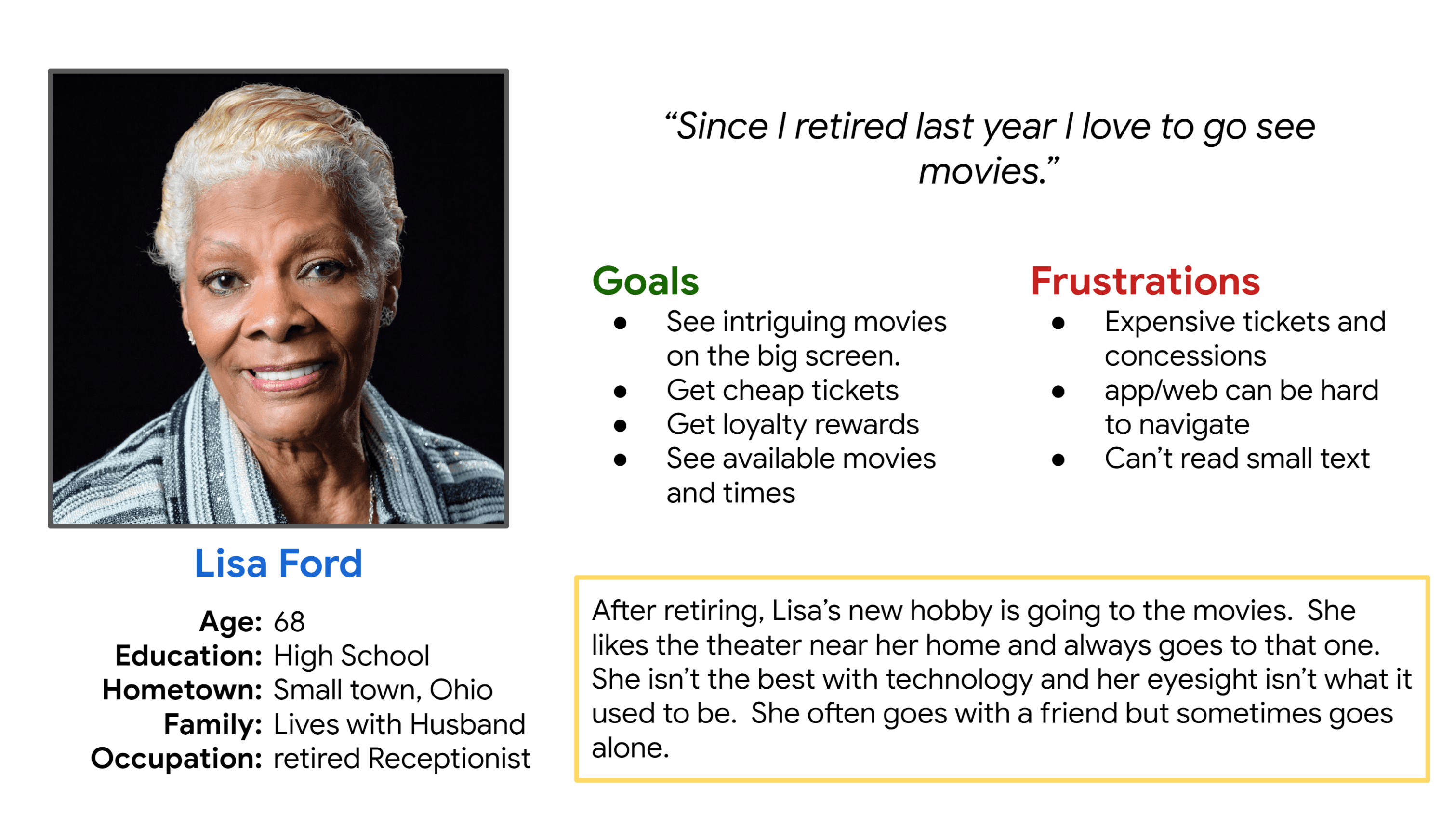
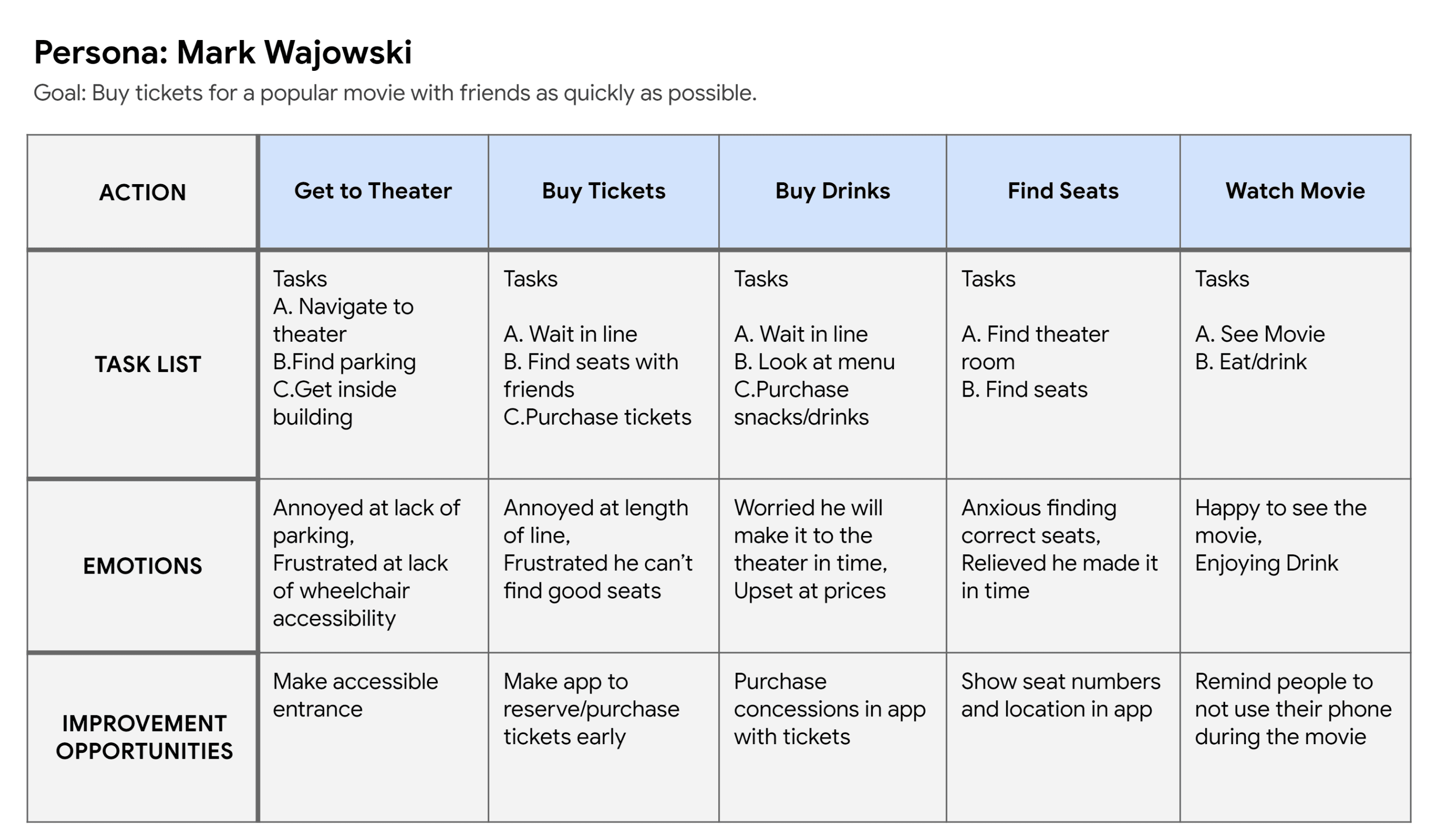
Persona: Lisa
Persona: Lisa
Persona: Lisa
Problem Statement:
Problem Statement:
Problem Statement:
Lisa is a retired receptionist who needs a way to save money on tickets because she sees movies so often.
Lisa is a retired receptionist who needs a way to save money on tickets because she sees movies so often.
Lisa is a retired receptionist who needs a way to save money on tickets because she sees movies so often.
User Journey Map
User Journey Map
User Journey Map
Mapping Mark’s user journey revealed how helpful it would be for users to have a dedicated Moo V app.
Mapping Mark’s user journey revealed how helpful it would be for users to have a dedicated Moo V app.
Mapping Mark’s user journey revealed how helpful it would be for users to have a dedicated Moo V app.
Starting the Design
Starting the Design
Starting the Design
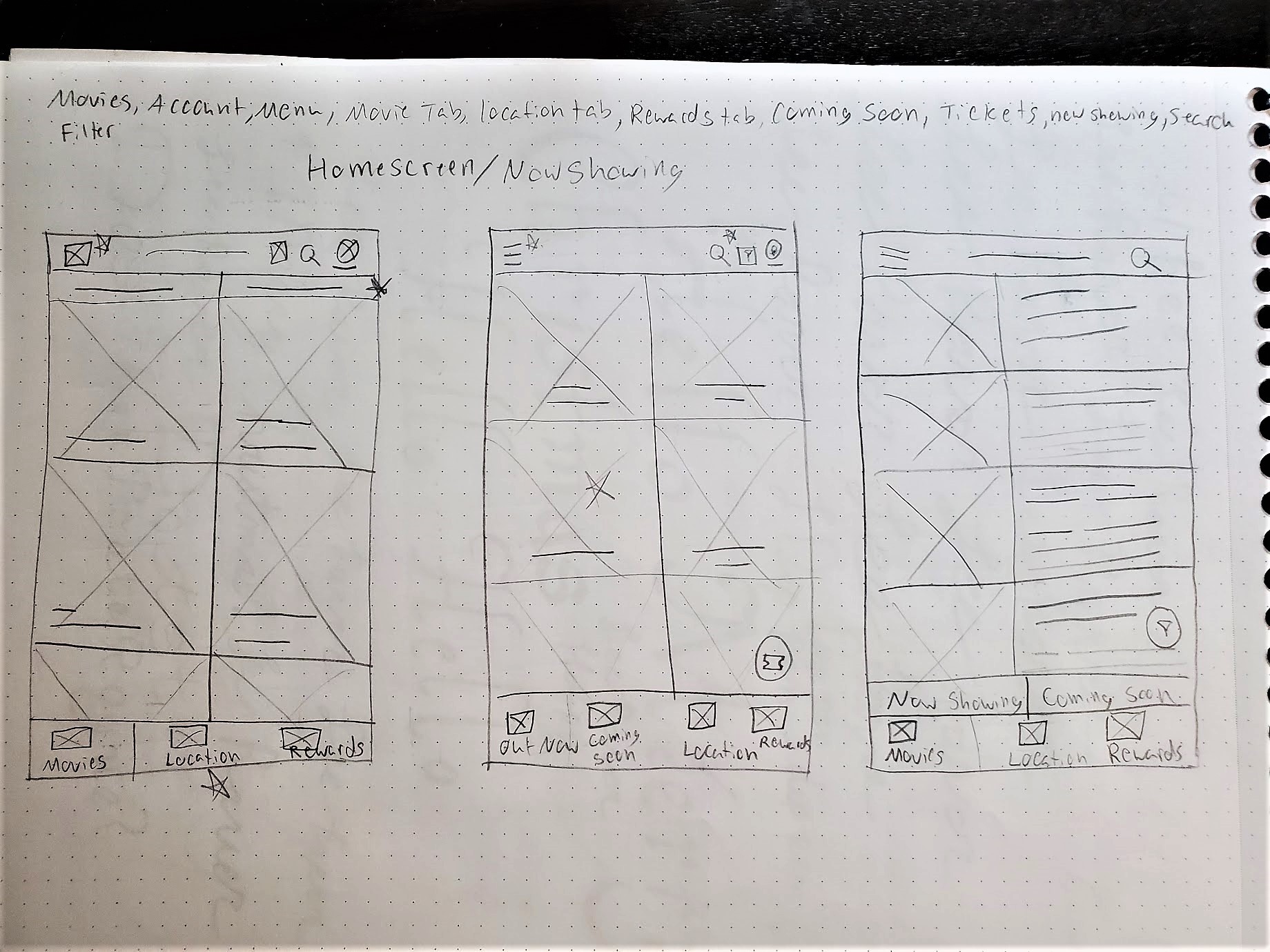
Paper Wireframes
Paper Wireframes
Paper Wireframes
I tried a few iterations of each screen and added stars next to elements I would use in the final version.
I used my user research and competitive audit to inform my designs.
I tried a few iterations of each screen and added stars next to elements I would use in the final version.
I used my user research and competitive audit to inform my designs.
I tried a few iterations of each screen and added stars next to elements I would use in the final version.
I used my user research and competitive audit to inform my designs.
Final version
Final version
Final version
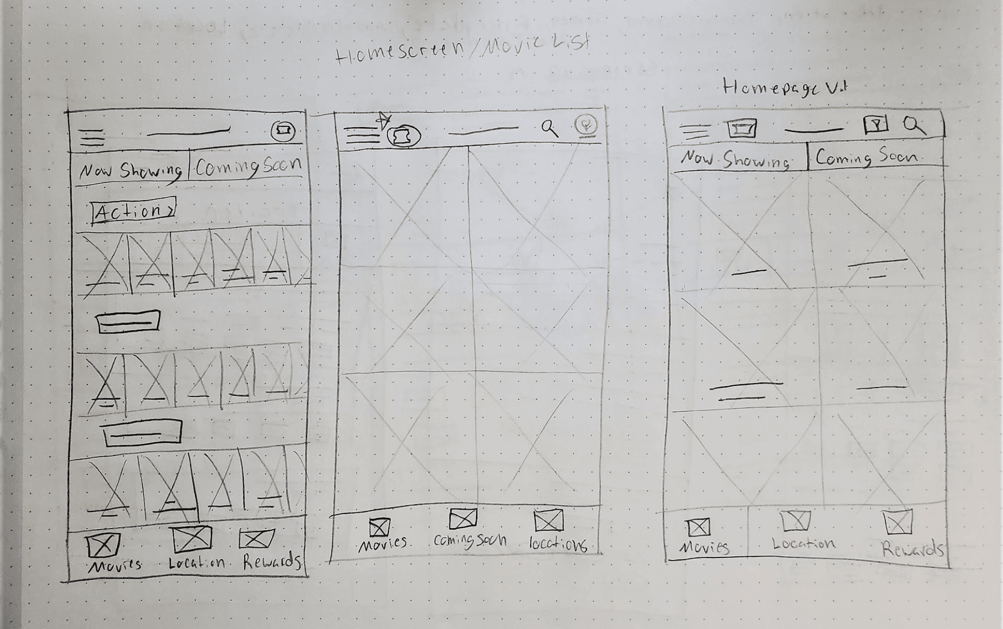
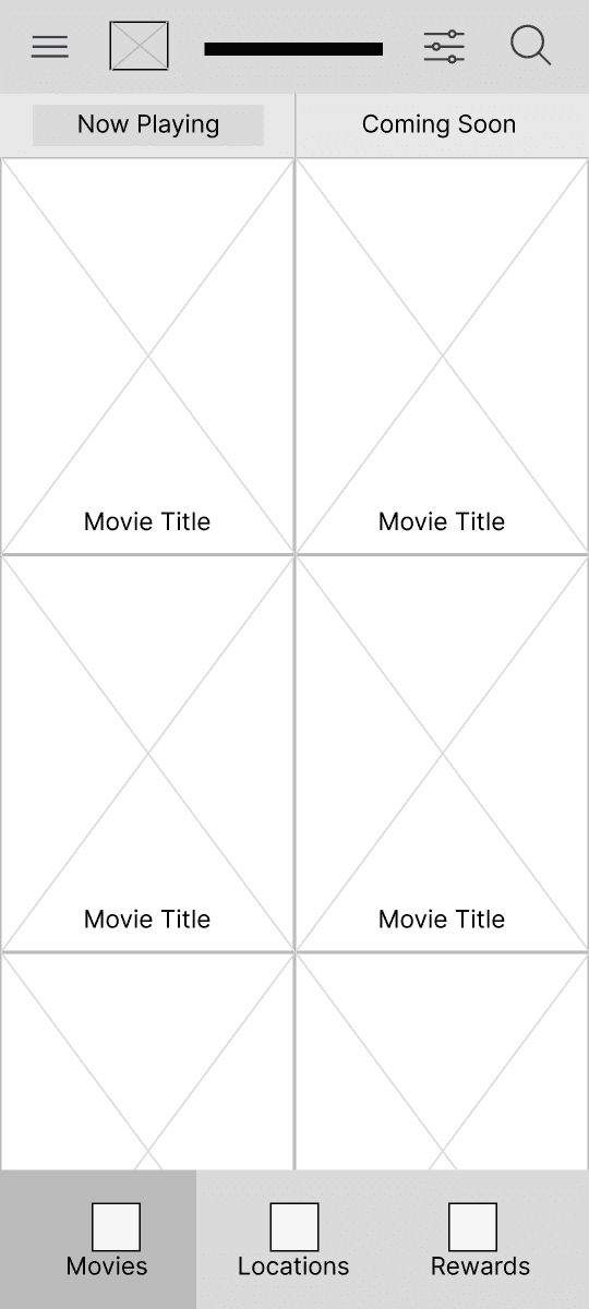
Digital Wireframes
Digital Wireframes
Digital Wireframes
As the initial design phase continued, I made sure to base screen designs on feedback and findings from user research.
As the initial design phase continued, I made sure to base screen designs on feedback and findings from user research.
As the initial design phase continued, I made sure to base screen designs on feedback and findings from user research.
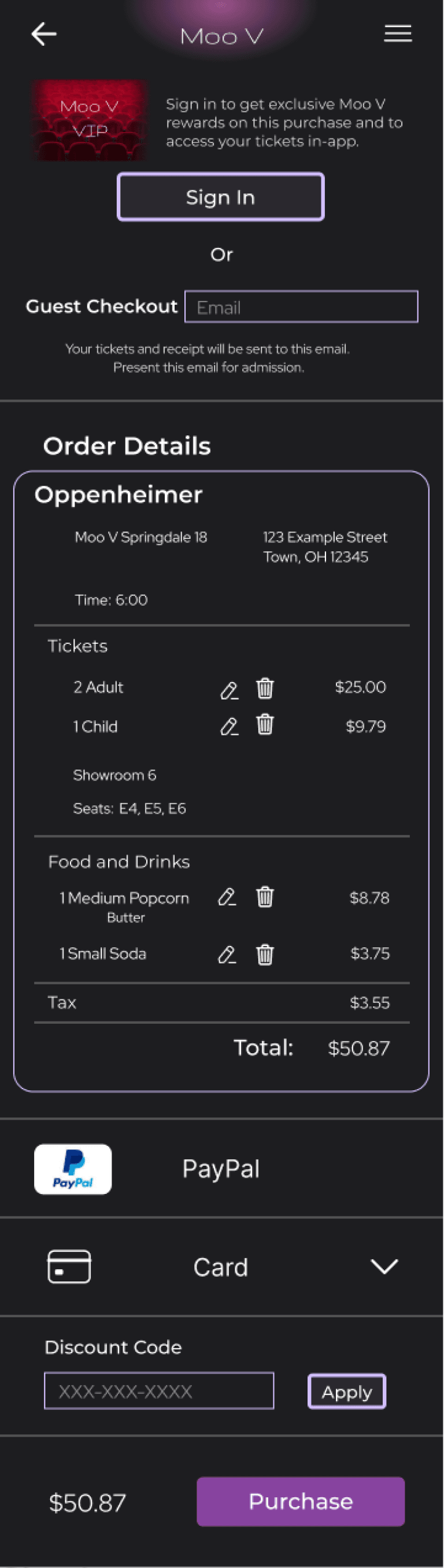
I added a feature to view your tickets in-app for easy access.
I added a feature to view your tickets in-app for easy access.
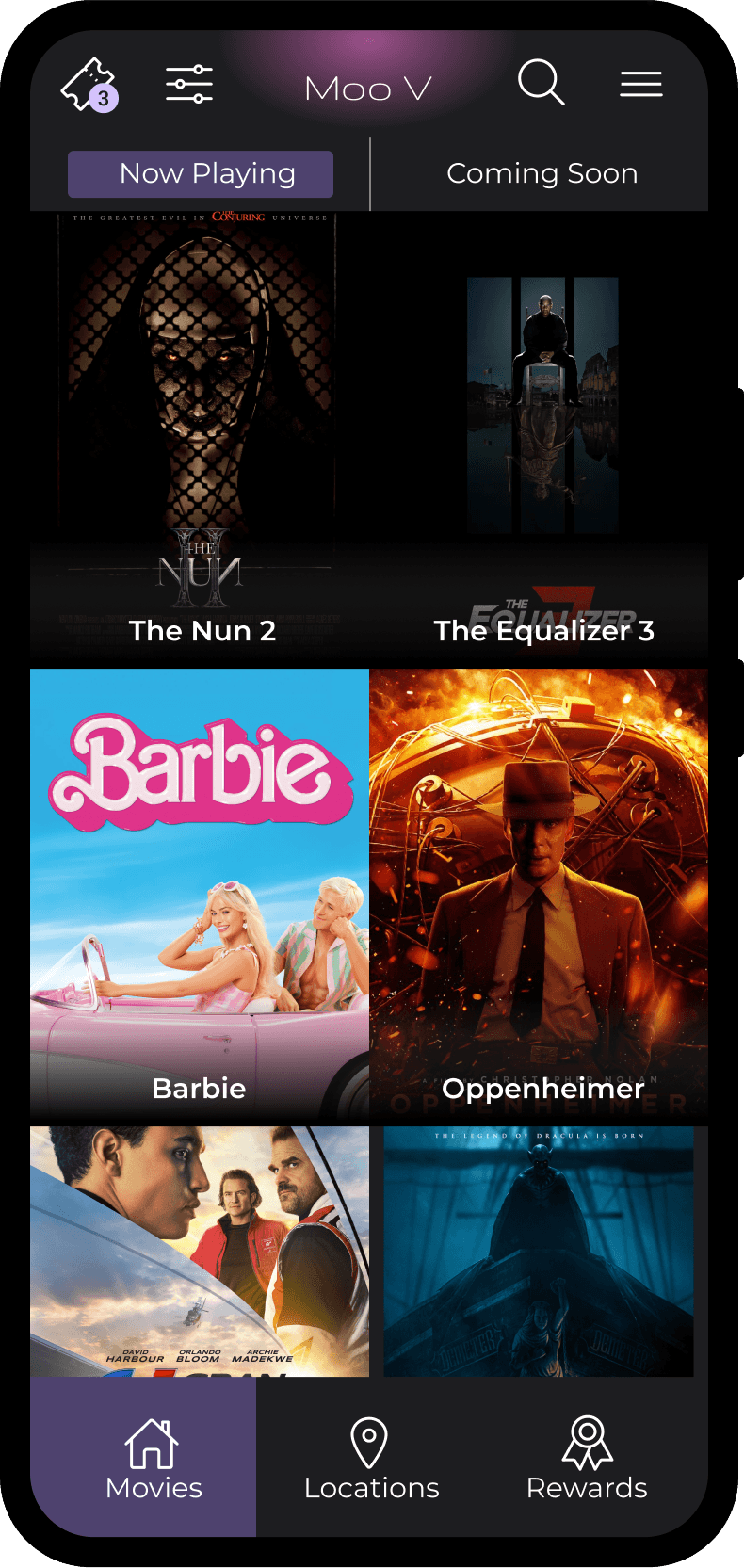
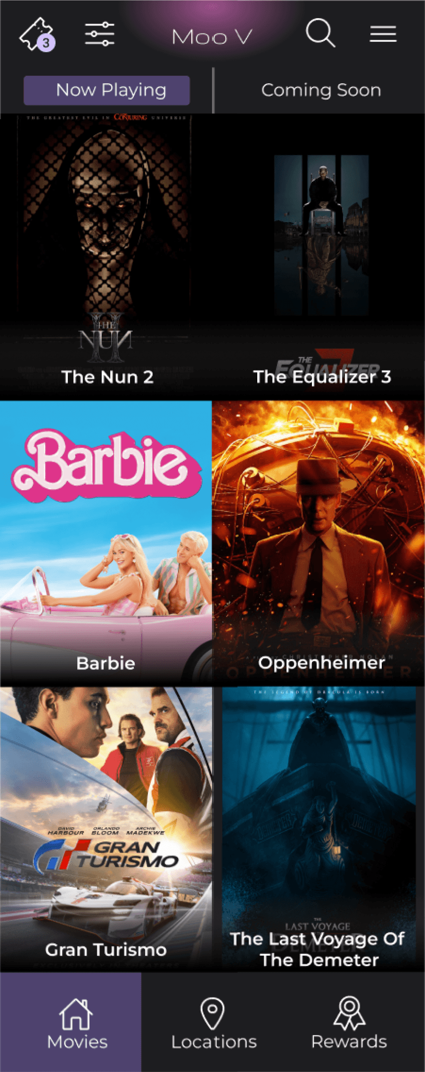
Users indicated they liked a homescreen with just movies and no extra clutter.
Users indicated they liked a homescreen with just movies and no extra clutter.
Users indicated they liked a homescreen with just movies and no extra clutter.
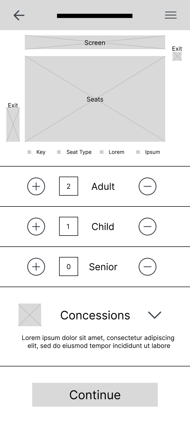
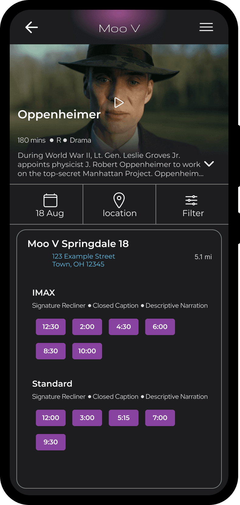
Condensing each step into one screen keeps the user from going back and forth between screens.
Condensing each step into one screen keeps the user from going back and forth between screens.
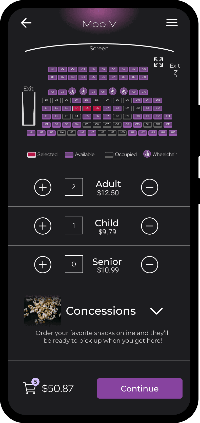
Exits on the seatmap help users plan where they want to sit.
Exits on the seatmap help users plan where they want to sit.
My goal was to condense multiple steps to create the fastest and easiest flow possible.
My goal was to condense multiple steps to create the fastest and easiest flow possible.
My goal was to condense multiple steps to create the fastest and easiest flow possible.
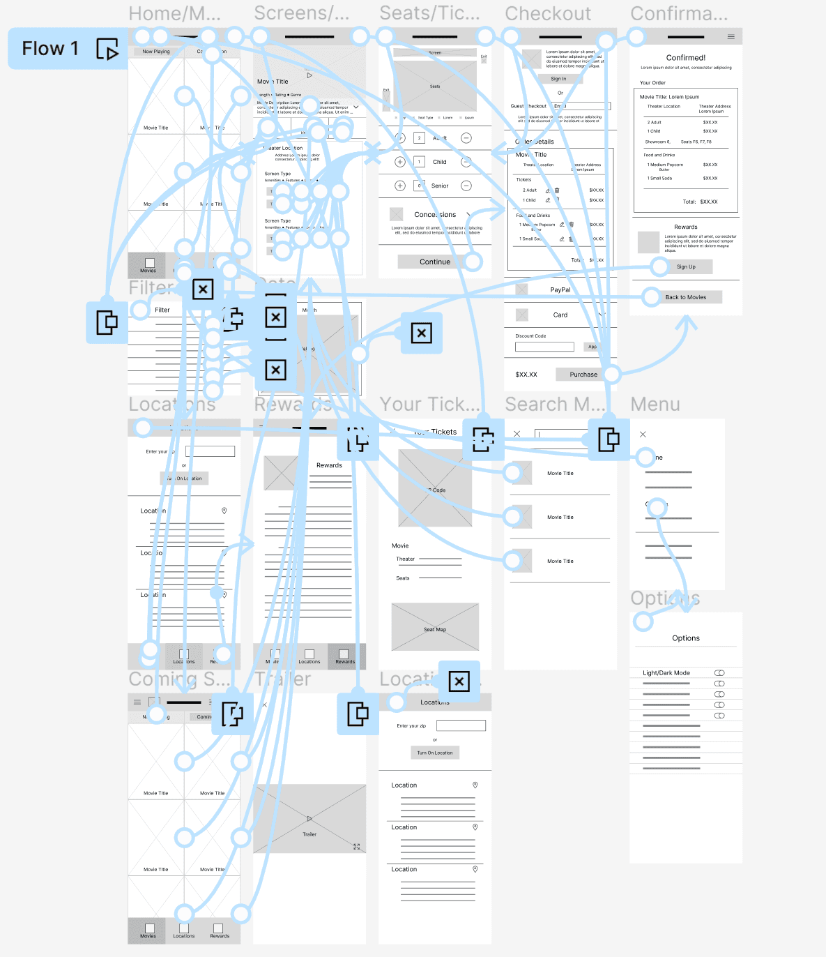
Low-fidelity Prototype
Low-fidelity Prototype
Low-fidelity Prototype
The Lofi Prototype connected the main user flow to be used for a usability study.
It turns the static wireframes into something that can be interacted with.
The Lofi Prototype connected the main user flow to be used for a usability study.
It turns the static wireframes into something that can be interacted with.
The Lofi Prototype connected the main user flow to be used for a usability study.
It turns the static wireframes into something that can be interacted with.
View Lofi Prototype
View Lofi Prototype
View Lofi Prototype
Usability Study: Findings
Usability Study: Findings
Usability Study: Findings
I conducted two rounds of usability studies. Findings from the first study helped guide the designs from wireframes to mockups. The second study used a high fidelity prototype and revealed what aspects of the mockups needed refining.
I conducted two rounds of usability studies. Findings from the first study helped guide the designs from wireframes to mockups. The second study used a high fidelity prototype and revealed what aspects of the mockups needed refining.
I conducted two rounds of usability studies. Findings from the first study helped guide the designs from wireframes to mockups. The second study used a high fidelity prototype and revealed what aspects of the mockups needed refining.
Round 1 Findings
Round 1 Findings
Round 1 Findings
1
1
1
Users liked the initial design.
Users liked the initial design.
Users liked the initial design.
2
2
2
Users preferred calling it “home” rather than”movies.”
Users preferred calling it “home” rather than”movies.”
Users preferred calling it “home” rather than”movies.”
3
3
3
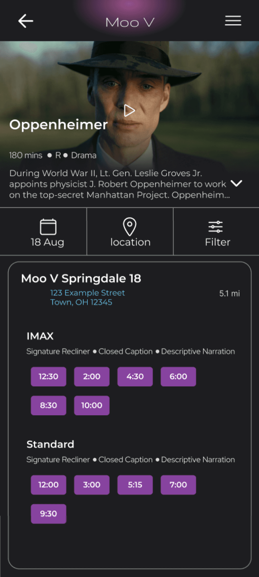
Users didn’t like when past showtimes were shown.
Users didn’t like when past showtimes were shown.
Users didn’t like when past showtimes were shown.
Round 2 Findings
Round 2 Findings
Round 2 Findings
1
1
1
The view tickets feature was hard to find.
The view tickets feature was hard to find.
The view tickets feature was hard to find.
2
2
2
Users would like a cart feature while picking seats.
Users would like a cart feature while picking seats.
Users would like a cart feature while picking seats.
3
3
3
Users would like more color on the seatmap.
Users would like more color on the seatmap.
Users would like more color on the seatmap.
Refining the Design
Refining the Design
Refining the Design
Mockups
Mockups
Mockups
Early designs allowed for picking seats, ticket type, and snacks, but after the usability studies I added an expandable cart overlay to see and edit the order before the confirmation screen.
Early designs allowed for picking seats, ticket type, and snacks, but after the usability studies I added an expandable cart overlay to see and edit the order before the confirmation screen.
Early designs allowed for picking seats, ticket type, and snacks, but after the usability studies I added an expandable cart overlay to see and edit the order before the confirmation screen.
Before Usability Studies
Before Usability Studies
Before Usability Studies
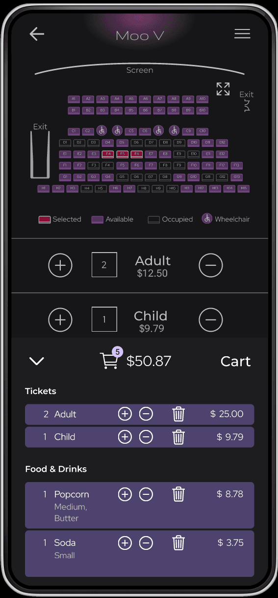
After Usability Studies
After Usability Studies
After Usability Studies
I also iterated on the seatmap based on user feedback that they wanted more color or to make it easier to understand. as well as small details throughout the app.
I also iterated on the seatmap based on user feedback that they wanted more color or to make it easier to understand. as well as small details throughout the app.
I also iterated on the seatmap based on user feedback that they wanted more color or to make it easier to understand. as well as small details throughout the app.
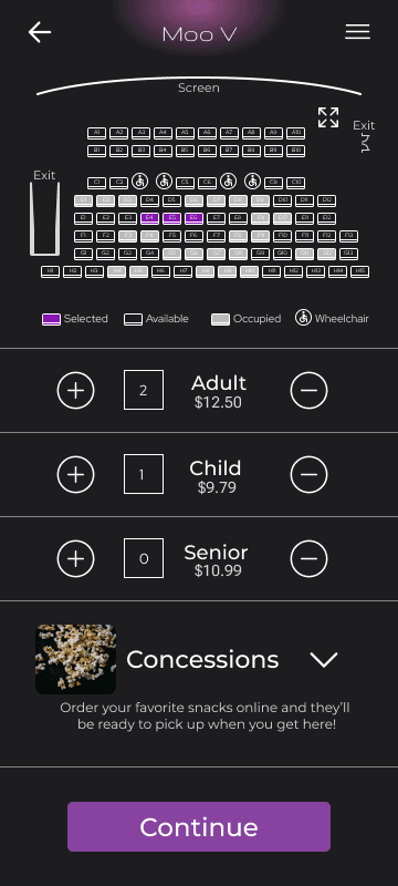
Before Usability Study 2
Before Usability Study 2
Before Usability Study 2
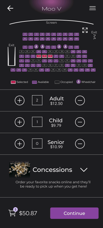
After Usability Study 2
After Usability Study 2
After Usability Study 2
Key Mockups
Key Mockups
Key Mockups

High-fidelity Prototype
High-fidelity Prototype
High-fidelity Prototype
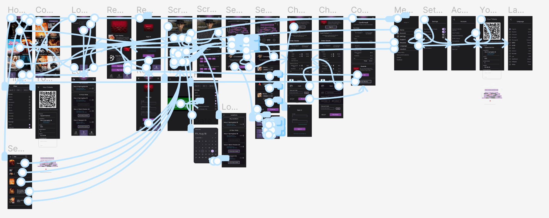
The Hifi Prototype represents a final version of the design and is built for user testing.
It presented a more refined design and more developed features to better meet user needs.
The Hifi Prototype represents a final version of the design and is built for user testing.
It presented a more refined design and more developed features to better meet user needs.
The Hifi Prototype represents a final version of the design and is built for user testing.
It presented a more refined design and more developed features to better meet user needs.
View Hifi Prototype
View Hifi Prototype
View Hifi Prototype
Accessibility Considerations
Accessibility Considerations
Accessibility Considerations
1
1
1
Icons are used heavily to help guide users to the features they are looking for.
Icons are used heavily to help guide users to the features they are looking for.
Icons are used heavily to help guide users to the features they are looking for.
2
2
2
I made sure to check the color contrast throughout the app to meet accessibility needs.
I made sure to check the color contrast throughout the app to meet accessibility needs.
I made sure to check the color contrast throughout the app to meet accessibility needs.
3
3
3
The app has a zoom feature on the seatmap where the text is smaller.
The app has a zoom feature on the seatmap where the text is smaller.
The app has a zoom feature on the seatmap where the text is smaller.
Going Forward
Going Forward
Going Forward
Takeaways
Takeaways
Takeaways
Impact:
Impact:
Impact:
Most of the participants who used the app during the usability studies said they liked my app more than AMC and Cinemark, which was one of my goals. My app was simpler, easier to use, and less cluttered. They also enjoyed the color scheme and visual design, calling it “soothing.”
Most of the participants who used the app during the usability studies said they liked my app more than AMC and Cinemark, which was one of my goals. My app was simpler, easier to use, and less cluttered. They also enjoyed the color scheme and visual design, calling it “soothing.”
Most of the participants who used the app during the usability studies said they liked my app more than AMC and Cinemark, which was one of my goals. My app was simpler, easier to use, and less cluttered. They also enjoyed the color scheme and visual design, calling it “soothing.”
What I Learned:
What I Learned:
What I Learned:
This project showed that putting the user first and building a fundamentally simple and efficient user flow and navigation creates a better ux than making a design complicated and cluttered.
This project showed that putting the user first and building a fundamentally simple and efficient user flow and navigation creates a better ux than making a design complicated and cluttered.
This project showed that putting the user first and building a fundamentally simple and efficient user flow and navigation creates a better ux than making a design complicated and cluttered.
Next Steps
Next Steps
Next Steps
1
1
1
Continue to flesh-out and refine other user flows like the rewards program.
Continue to flesh-out and refine other user flows like the rewards program.
Continue to flesh-out and refine other user flows like the rewards program.
2
2
2
Further refine the visual design of the app to make it look more interesting without losing the simple design.
Further refine the visual design of the app to make it look more interesting without losing the simple design.
Further refine the visual design of the app to make it look more interesting without losing the simple design.
3
3
3
Conduct usability studies with the new features like the cart and new badge on the ticket icon.
Conduct usability studies with the new features like the cart and new badge on the ticket icon.
Conduct usability studies with the new features like the cart and new badge on the ticket icon.
Lets Connect!
Lets Connect!
Lets Connect!
Thank you for reviewing my work on the Moo V app! If you’d like to see more or get in touch, you can copy my email address to your clipboard below or find me on LinkedIn.
Thank you for reviewing my work on the Moo V app! If you’d like to see more or get in touch, you can copy my email address to your clipboard below or find me on LinkedIn.
Thank you for reviewing my work on the Moo V app! If you’d like to see more or get in touch, you can copy my email address to your clipboard below or find me on LinkedIn.