Moo V
Responsive Website
Responsive Website
Responsive Website
Contents
Contents
Contents
Understanding the User
Understanding the User
Understanding the User
Starting the Design
Starting the Design
Starting the Design
Refining the Design
Refining the Design
Refining the Design
Going Forward
Going Forward
Going Forward
View Lofi Prototype
View Lofi Prototype
View Lofi Prototype
View Hifi Prototype
View Hifi Prototype
View Hifi Prototype
Project Overview
Project Overview
Project Overview
The Product
The Product
The Product
Moo V is a hypothetical new movie theater franchise competing with the likes of AMC, Cinemark, and Regal.
The Problem
The Problem
The Problem
They need a website so their customers can browse and purchase movie tickets online.
The Goal
The Goal
The Goal
Design a responsive website for Moo V that allows users to easily browse movies and purchase tickets online.
My personal goal was to develop more advanced skills in Figma design and prototyping.
Design a responsive website for Moo V that allows users to easily browse movies and purchase tickets online.
My personal goal was to develop more advanced skills in Figma design and prototyping.
Design a responsive website for Moo V that allows users to easily browse movies and purchase tickets online.
My personal goal was to develop more advanced skills in Figma design and prototyping.
My Role
My Role
My Role
UX Designer creating a responsive website for Moo V from the ground up.
Responsibilities
Responsibilities
Responsibilities
Everything from ideating, user research, wireframing, prototyping, user testing, and creating the final designs.
Project Duration
Project Duration
Project Duration
October to December 2023
Understanding the User
Understanding the User
Understanding the User
User Research: Summary
User Research: Summary
User Research: Summary
I conducted a competitive analysis on major competitors such as AMC, Cinemark, etc. to gain an understanding of their brand and products. I also conducted user interviews where I had users interact with the competitors’ products and asked about their thoughts on the products and their past experiences.
I conducted a competitive analysis on major competitors such as AMC, Cinemark, etc. to gain an understanding of their brand and products. I also conducted user interviews where I had users interact with the competitors’ products and asked about their thoughts on the products and their past experiences.
I conducted a competitive analysis on major competitors such as AMC, Cinemark, etc. to gain an understanding of their brand and products. I also conducted user interviews where I had users interact with the competitors’ products and asked about their thoughts on the products and their past experiences.
Two user groups I identified were young adults wanting to buy specific tickets as fast and efficiently as possible and (older) people with free time looking to see available movies.
Two user groups I identified were young adults wanting to buy specific tickets as fast and efficiently as possible and (older) people with free time looking to see available movies.
Two user groups I identified were young adults wanting to buy specific tickets as fast and efficiently as possible and (older) people with free time looking to see available movies.
I figured the competition would have good products, but I found that they all had a poor user experience. User interviews confirmed this. This surprised me and I realized I could make a better product than the competition, which became my goal.
I figured the competition would have good products, but I found that they all had a poor user experience. User interviews confirmed this. This surprised me and I realized I could make a better product than the competition, which became my goal.
I figured the competition would have good products, but I found that they all had a poor user experience. User interviews confirmed this. This surprised me and I realized I could make a better product than the competition, which became my goal.
User Research: Pain Points
User Research: Pain Points
User Research: Pain Points
1
1
1
Too Busy
Too Busy
Too Busy
Most of the competitors’ websites and apps were too busy and cluttered. This made finding what you were looking for difficult.
Most of the competitors’ websites and apps were too busy and cluttered. This made finding what you were looking for difficult.
Most of the competitors’ websites and apps were too busy and cluttered. This made finding what you were looking for difficult.
2
2
2
Too Complicated
Too Complicated
Too Complicated
Some pages could be structured better and simplified. Users would prefer a simplified design.
Some pages could be structured better and simplified. Users would prefer a simplified design.
Some pages could be structured better and simplified. Users would prefer a simplified design.
3
3
3
Pop-ups
Pop-ups
Pop-ups
Some competitors had pop-ups in their products which is a huge frustration for users. They should be excluded.
Some competitors had pop-ups in their products which is a huge frustration for users. They should be excluded.
Some competitors had pop-ups in their products which is a huge frustration for users. They should be excluded.
4
4
4
Small Text
Small Text
Small Text
Some users have trouble seeing small text, especially on things like the seatmap and on mobile.
Some users have trouble seeing small text, especially on things like the seatmap and on mobile.
Some users have trouble seeing small text, especially on things like the seatmap and on mobile.
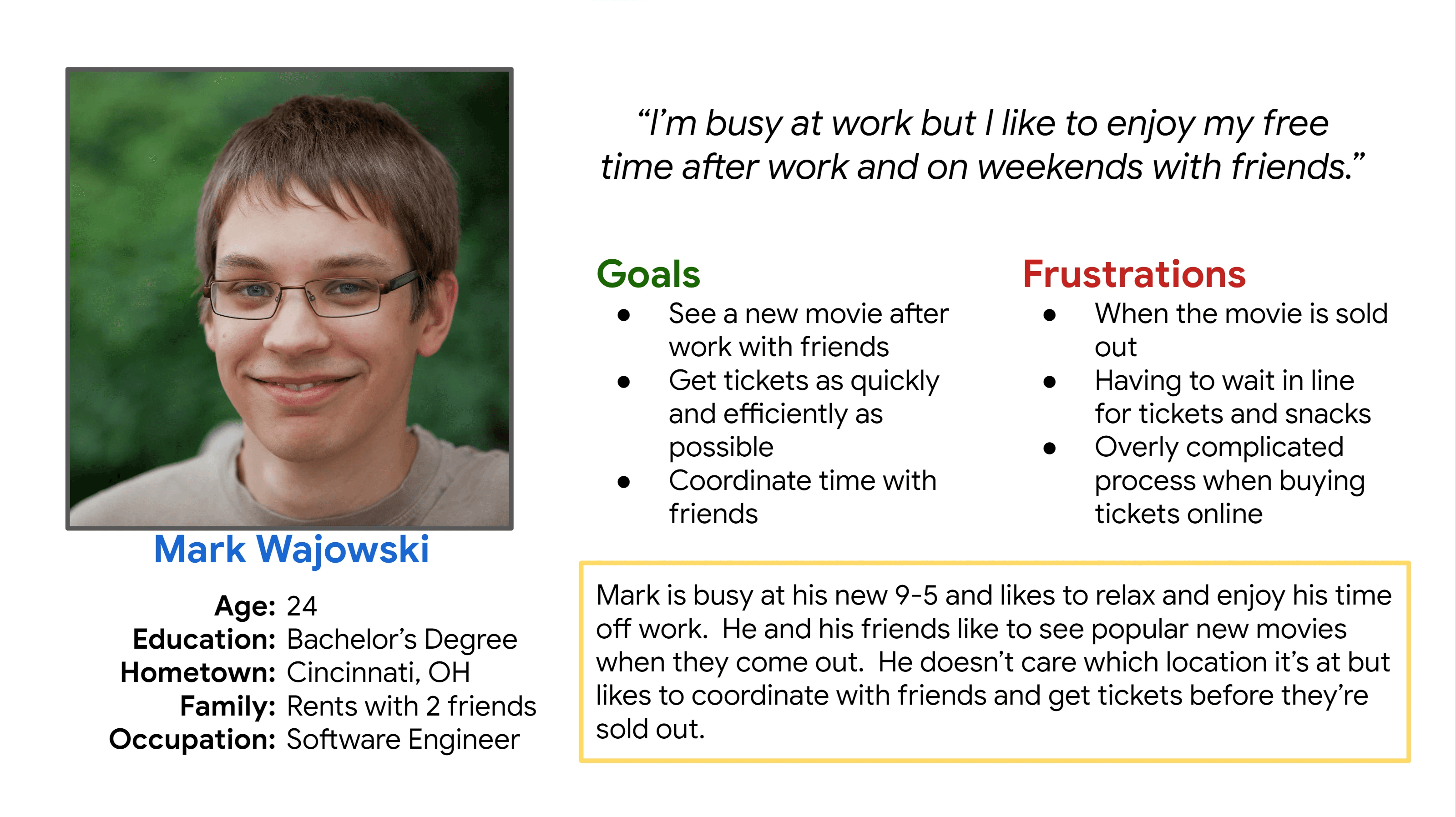
Persona: Mark
Persona: Mark
Persona: Mark
Problem Statement:
Problem Statement:
Problem Statement:
Mark is a busy software engineer who needs a way to buy movie tickets in advance because he likes to see them the day they come out.
Mark is a busy software engineer who needs a way to buy movie tickets in advance because he likes to see them the day they come out.
Mark is a busy software engineer who needs a way to buy movie tickets in advance because he likes to see them the day they come out.
Starting the Design
Starting the Design
Starting the Design
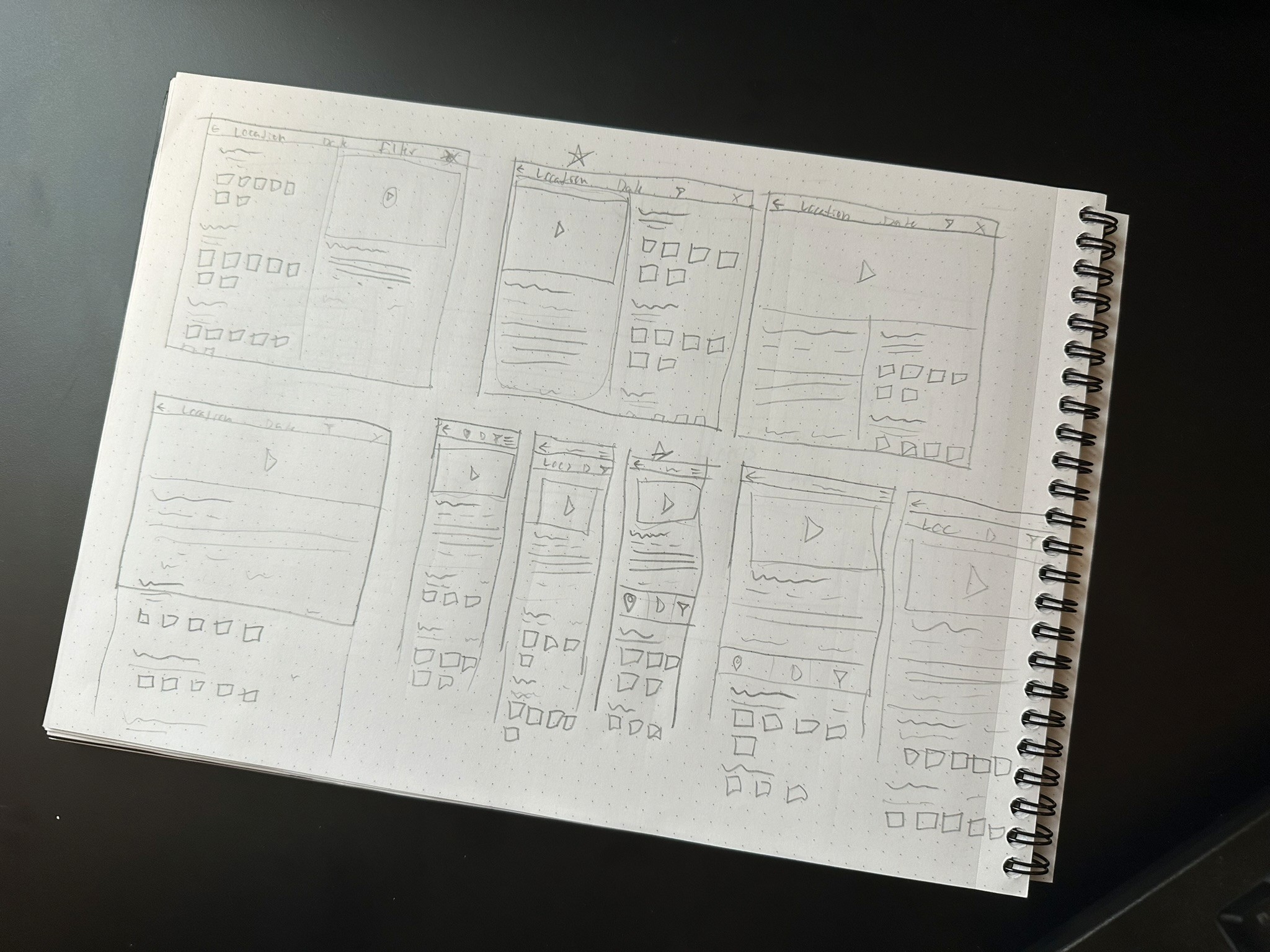
Paper Wireframes
Paper Wireframes
Paper Wireframes
First I sketched a few iterations of each page and then combined what I liked into a final version for each screen size. I used my user research and competitive audit to inform my designs.
First I sketched a few iterations of each page and then combined what I liked into a final version for each screen size. I used my user research and competitive audit to inform my designs.
First I sketched a few iterations of each page and then combined what I liked into a final version for each screen size. I used my user research and competitive audit to inform my designs.
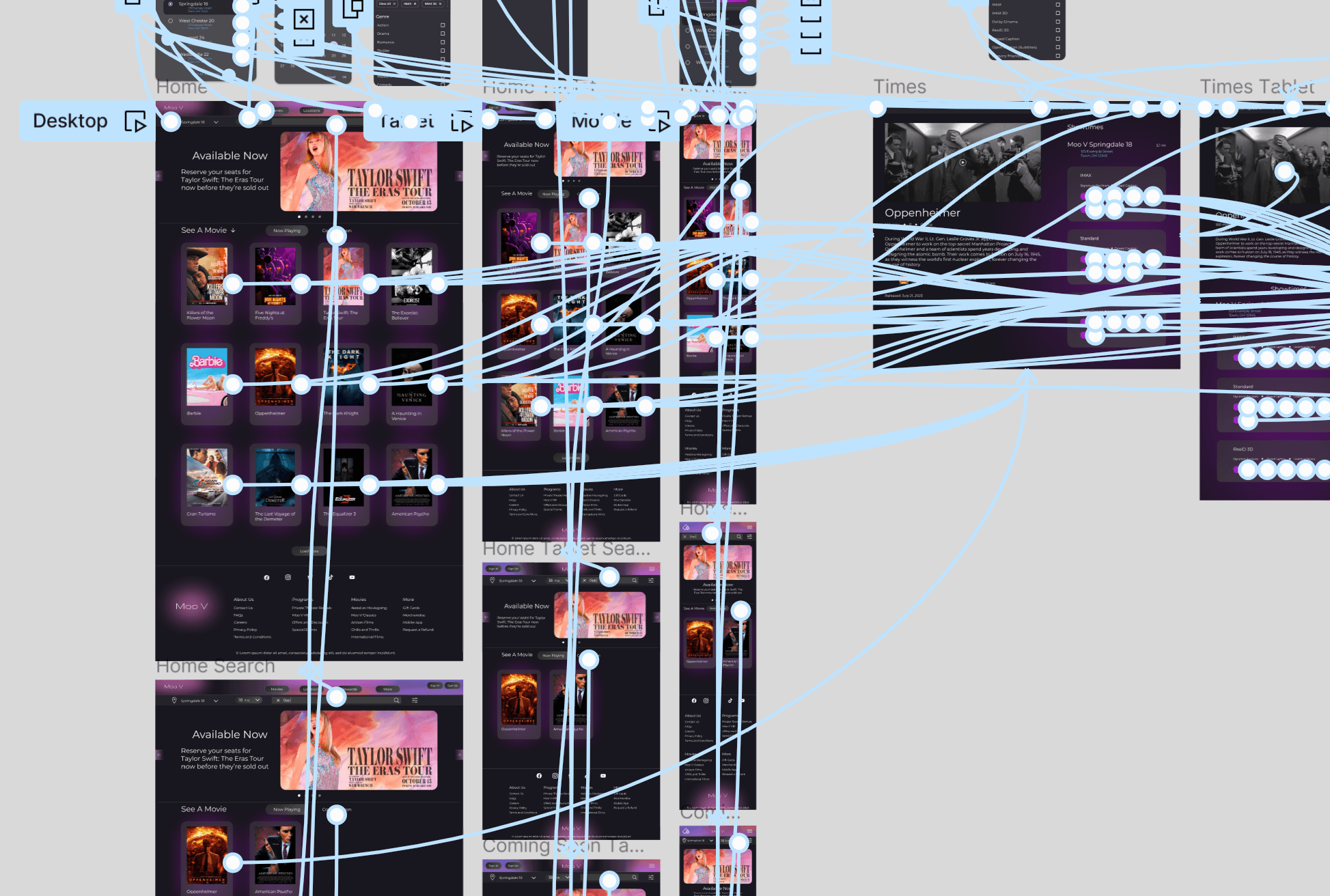
Digital Wireframes
Digital Wireframes
Digital Wireframes
As the initial design phase continued, I made sure to base my designs on feedback from user research.
As the initial design phase continued, I made sure to base my designs on feedback from user research.
As the initial design phase continued, I made sure to base my designs on feedback from user research.
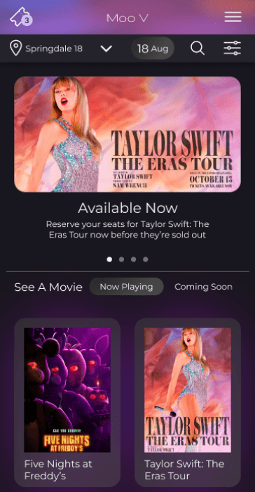
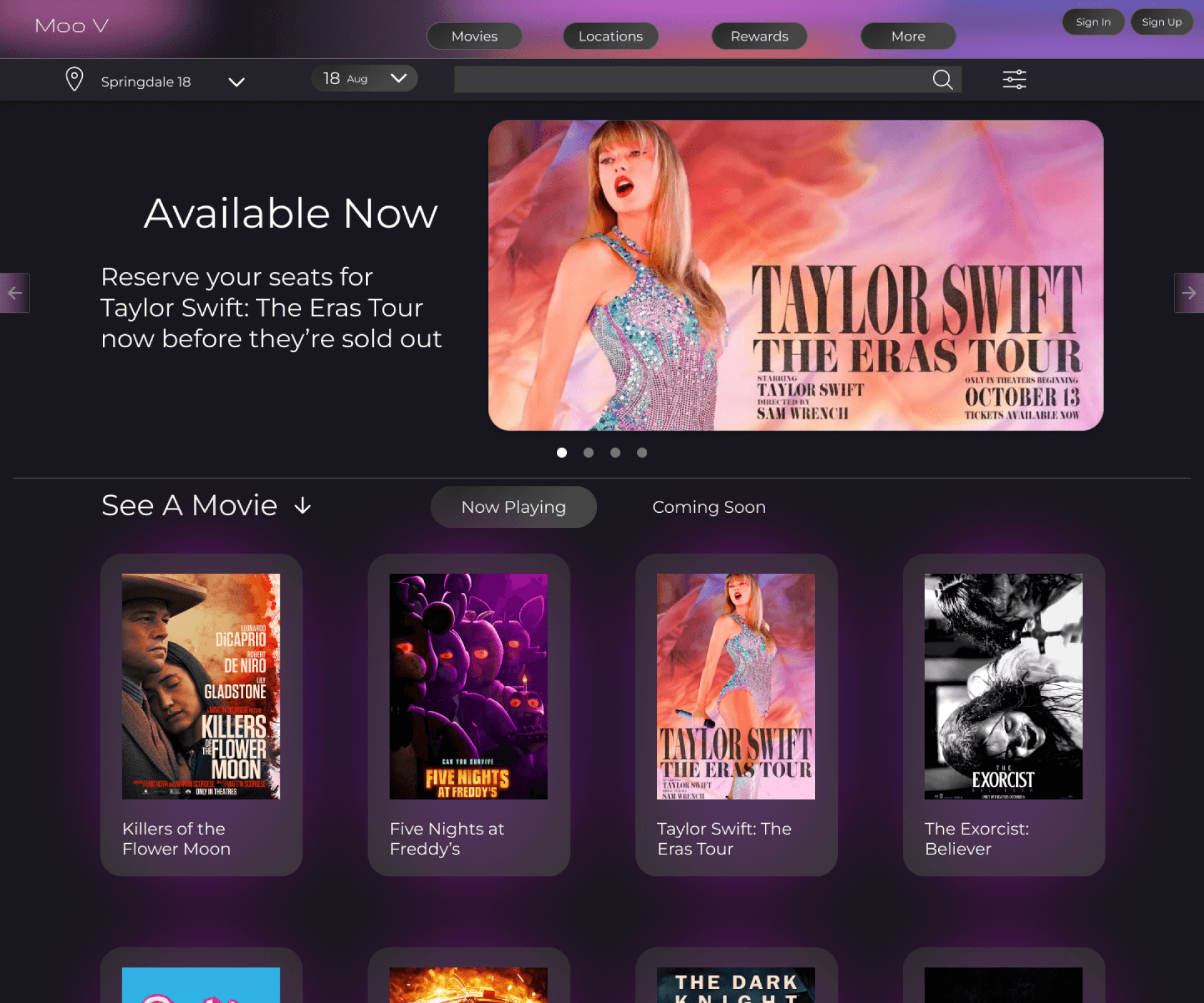
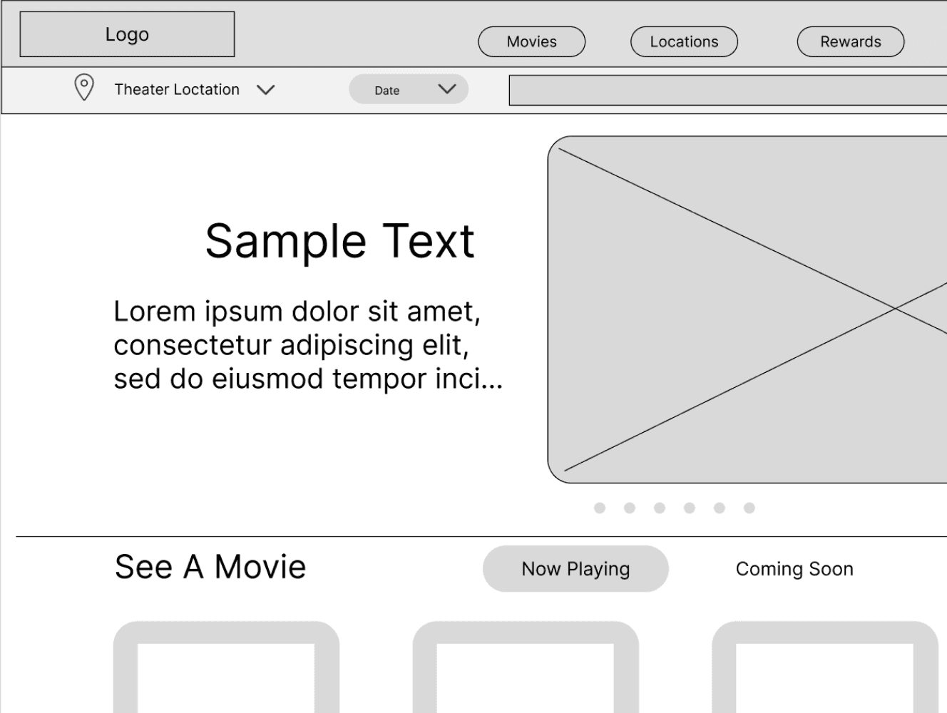
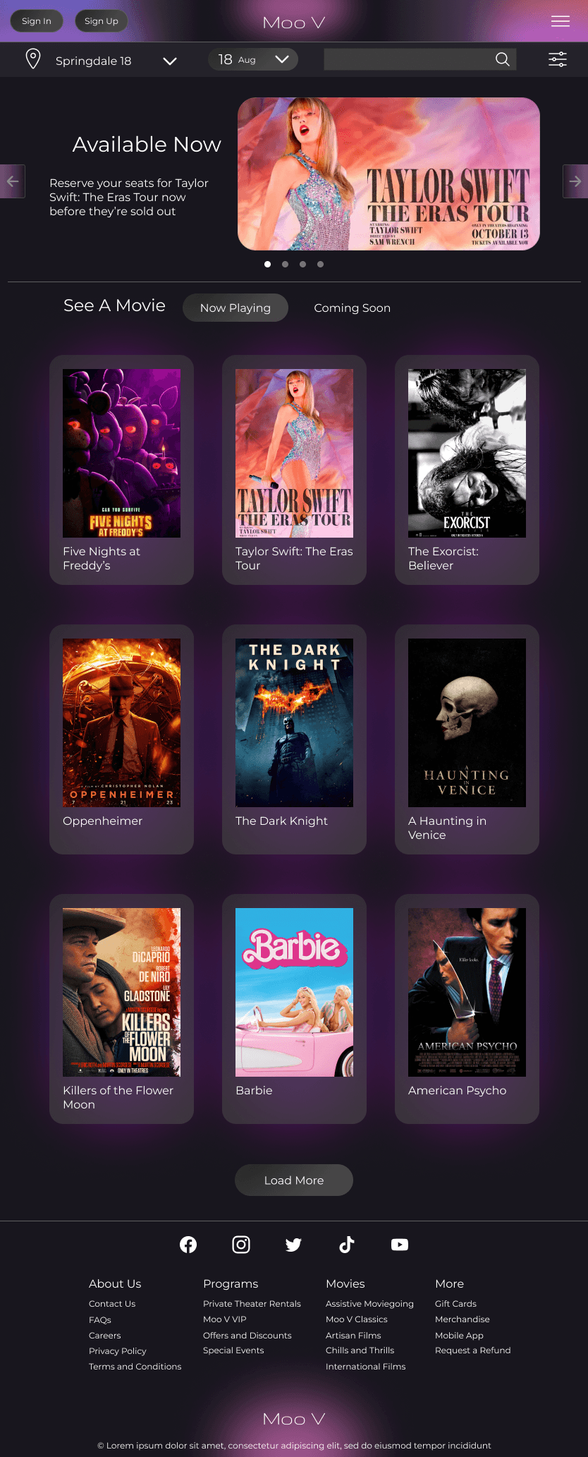
Home Page (Desktop)
Home Page (Desktop)
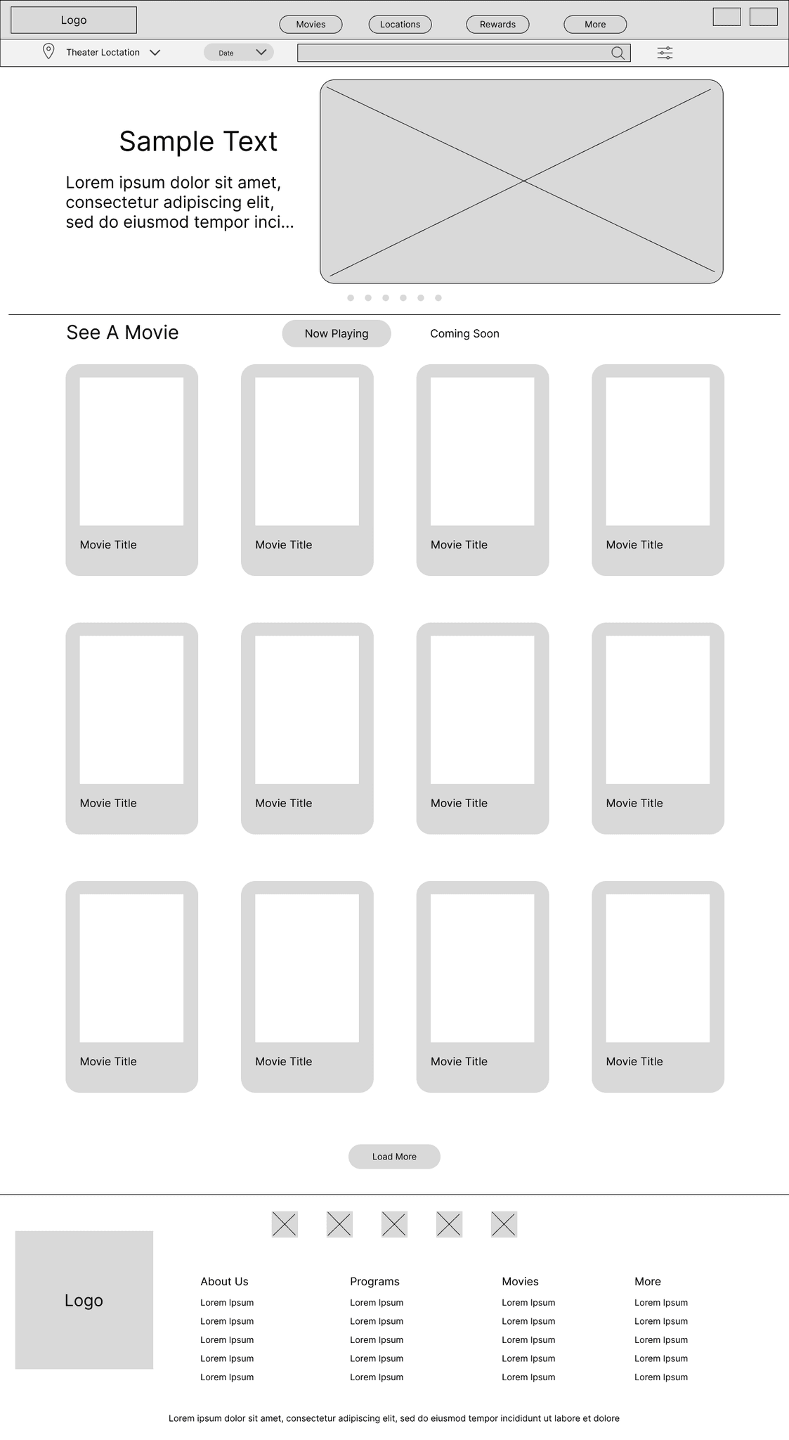
Movie selection is the home page because that is what most users are here for.
Movie selection is the home page because that is what most users are here for.
I tried to keep it as simple and clean as possible.
I tried to keep it as simple and clean as possible.
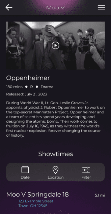
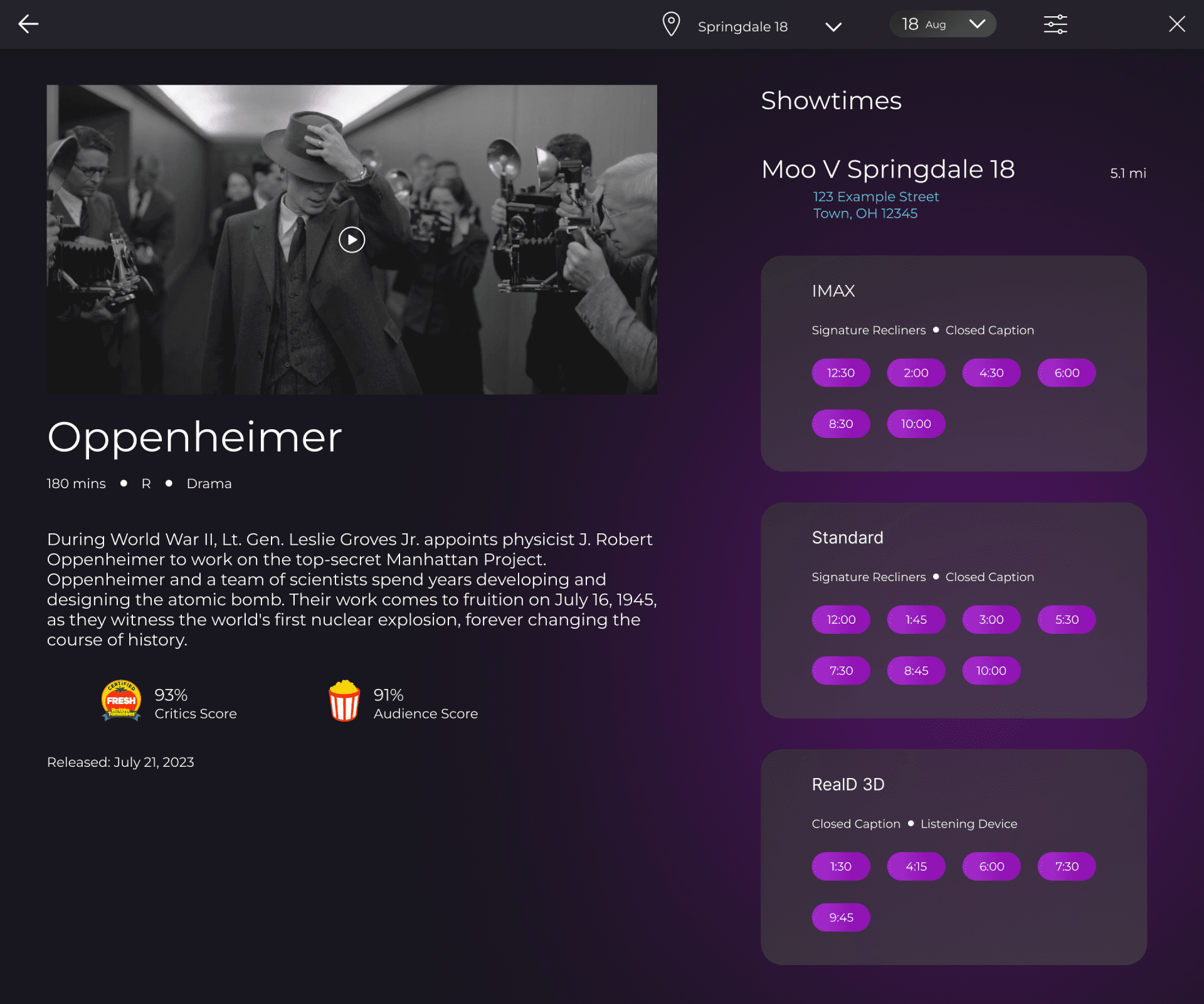
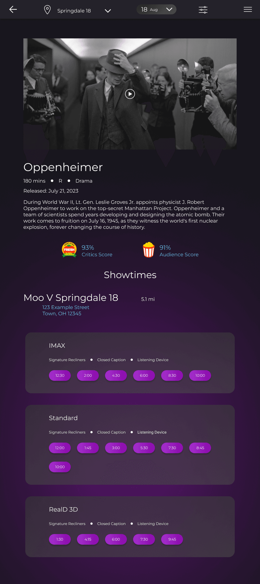
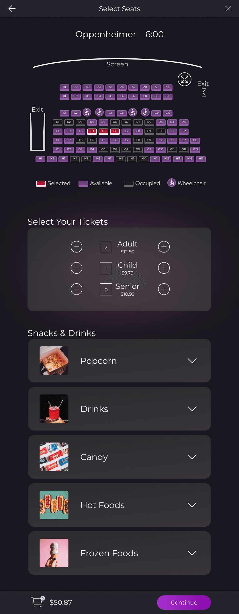
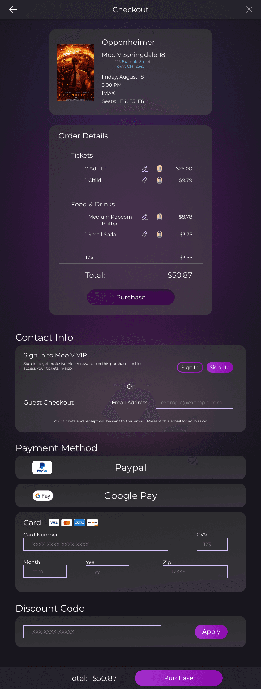
Tickets Screen (Tablet)
Tickets Screen (Tablet)
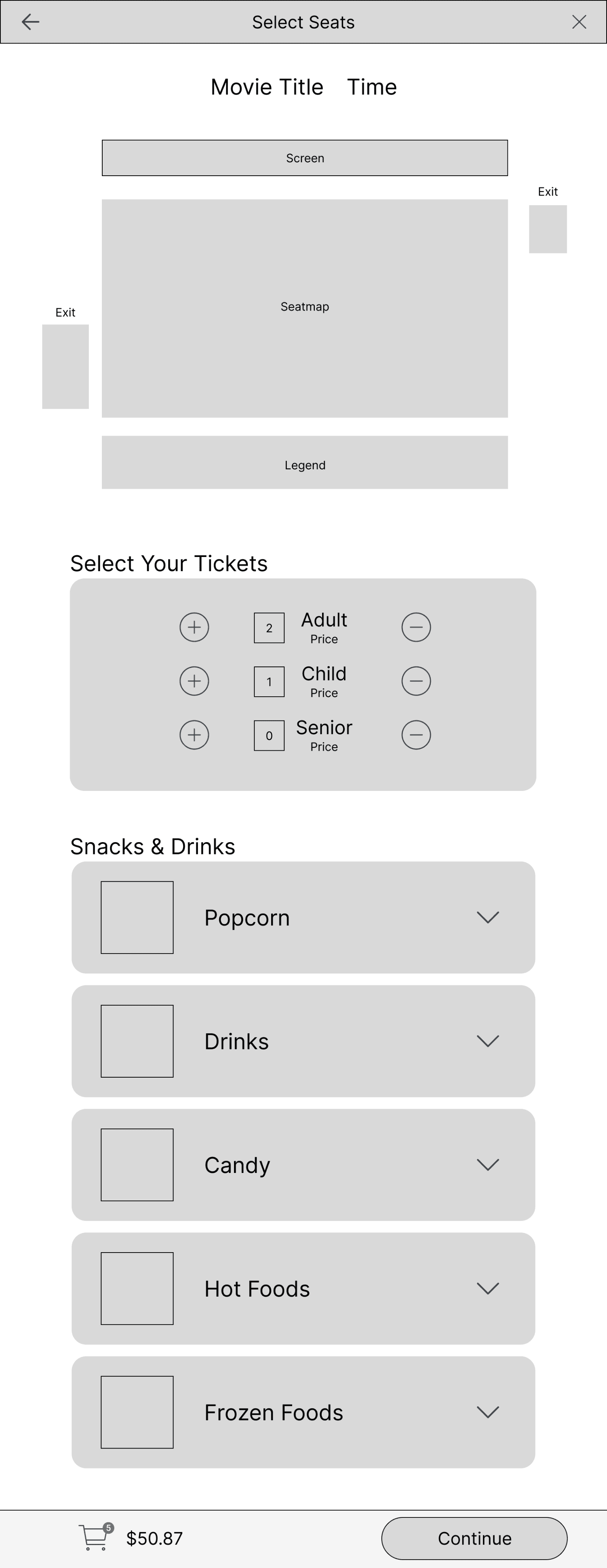
Users pick their seats and order food on the same page to avoid shuffling between pages.
Users pick their seats and order food on the same page to avoid shuffling between pages.
Users can view everything in their cart from the same screen.
Users can view everything in their cart from the same screen.
One of my goals was to condense the user flow into the least amount of screens so it would be fast and easy.
One of my goals was to condense the user flow into the least amount of screens so it would be fast and easy.
One of my goals was to condense the user flow into the least amount of screens so it would be fast and easy.
Low-fidelity Prototype
Low-fidelity Prototype
Low-fidelity Prototype
I created a Low-fidelity Prototype which turned the designs into something users could interact with.
I then conducted a usability study to test the designs.
I created a Low-fidelity Prototype which turned the designs into something users could interact with.
I then conducted a usability study to test the designs.
I created a Low-fidelity Prototype which turned the designs into something users could interact with.
I then conducted a usability study to test the designs.
View Lofi Prototype
View Lofi Prototype
View Lofi Prototype
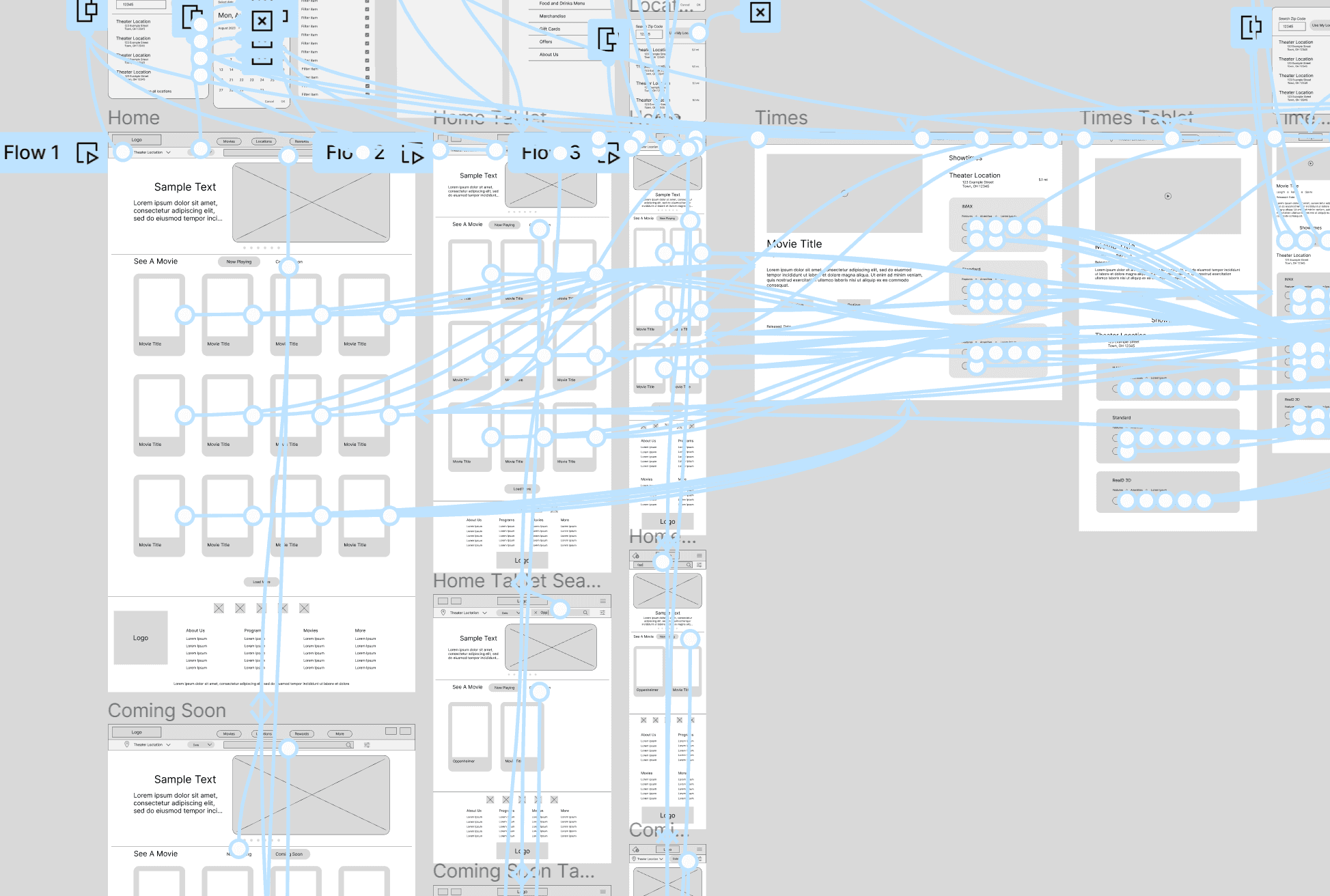
Under Options, click “fit width,” then hit “Ctrl + \” to hide the Figma UI
Under Options, click “fit width,” then hit “Ctrl + \” to hide the Figma UI
Usability Study: Findings
Usability Study: Findings
Usability Study: Findings
I conducted two rounds of usability studies. Findings from the first study helped guide the designs from wireframes to mockups. The second study used a high fidelity prototype and revealed what aspects of the mockups needed refining.
I conducted two rounds of usability studies. Findings from the first study helped guide the designs from wireframes to mockups. The second study used a high fidelity prototype and revealed what aspects of the mockups needed refining.
I conducted two rounds of usability studies. Findings from the first study helped guide the designs from wireframes to mockups. The second study used a high fidelity prototype and revealed what aspects of the mockups needed refining.
Round 1 Findings
Round 1 Findings
Round 1 Findings
1
1
1
Some users didn't know to scroll down on the home page.
Some users didn't know to scroll down on the home page.
Some users didn't know to scroll down on the home page.
2
2
2
Users wanted "guest checkout" to be more obvious.
Users wanted "guest checkout" to be more obvious.
Users wanted "guest checkout" to be more obvious.
3
3
3
Users liked the initial design.
Users liked the initial design.
Users liked the initial design.
Round 2 Findings
Round 2 Findings
Round 2 Findings
1
1
1
Some users still didn't think to scroll down on the home page.
Some users still didn't think to scroll down on the home page.
Some users still didn't think to scroll down on the home page.
2
2
2
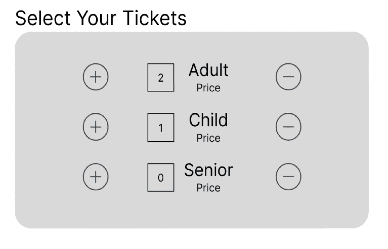
Having "-" on the left and "+" on the right would feel more natural.
Having "-" on the left and "+" on the right would feel more natural.
Having "-" on the left and "+" on the right would feel more natural.
3
3
3
Some users didn't notice that they could expand the seatmap.
Some users didn't notice that they could expand the seatmap.
Some users didn't notice that they could expand the seatmap.
Refining the Design
Refining the Design
Refining the Design
Mockups
Mockups
Mockups
I thought adding color and moving things above the fold would help users know to scroll, but they still had trouble. I added an arrow to help them know to scroll.
I thought adding color and moving things above the fold would help users know to scroll, but they still had trouble. I added an arrow to help them know to scroll.
I thought adding color and moving things above the fold would help users know to scroll, but they still had trouble. I added an arrow to help them know to scroll.
Before Usability Studies
Before Usability Studies
Before Usability Studies
After Usability Studies
After Usability Studies
After Usability Studies
Before Usability Studies
Before Usability Studies
Before Usability Studies
After Usability Studies
After Usability Studies
After Usability Studies
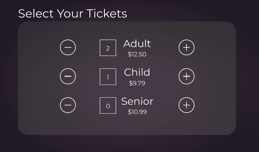
Some users noted that they would prefer the “+” and “-” signs be switched.. They didn’t mind the way it was, but it felt unnatural and they would click the wrong buttons sometimes.
Some users noted that they would prefer the “+” and “-” signs be switched. They didn’t mind the way it was, but it felt unnatural and they would click the wrong buttons sometimes.
Some users noted that they would prefer the “+” and “-” signs be switched. They didn’t mind the way it was, but it felt unnatural and they would click the wrong buttons sometimes.
Key Mockups (Tablet Version)
Key Mockups (Tablet Version)
Key Mockups (Tablet Version)
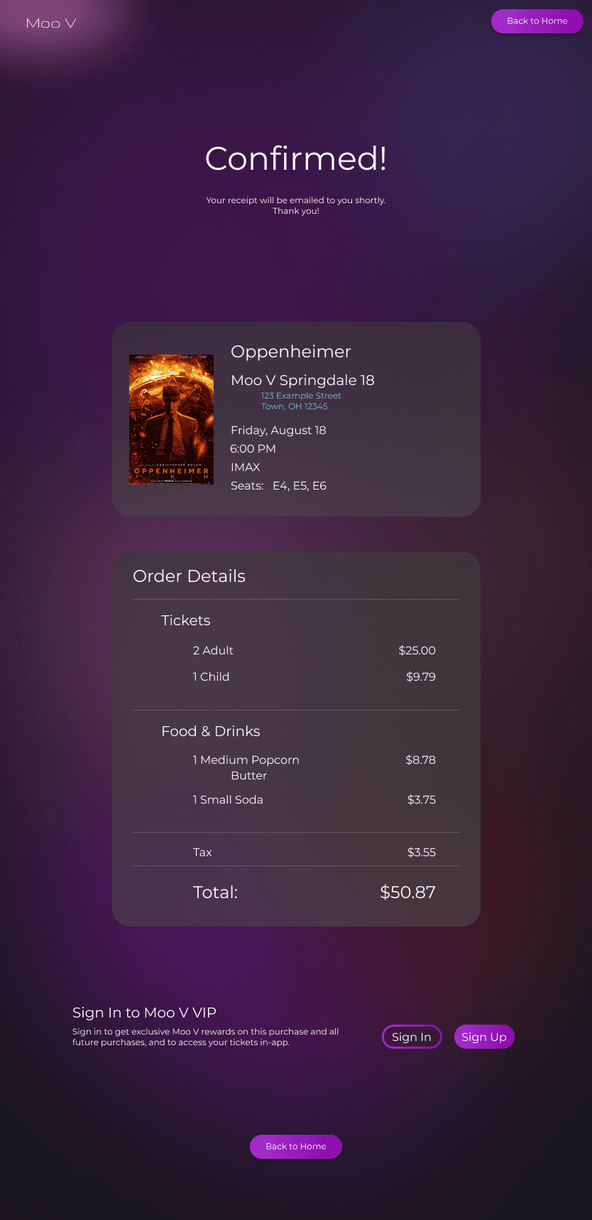
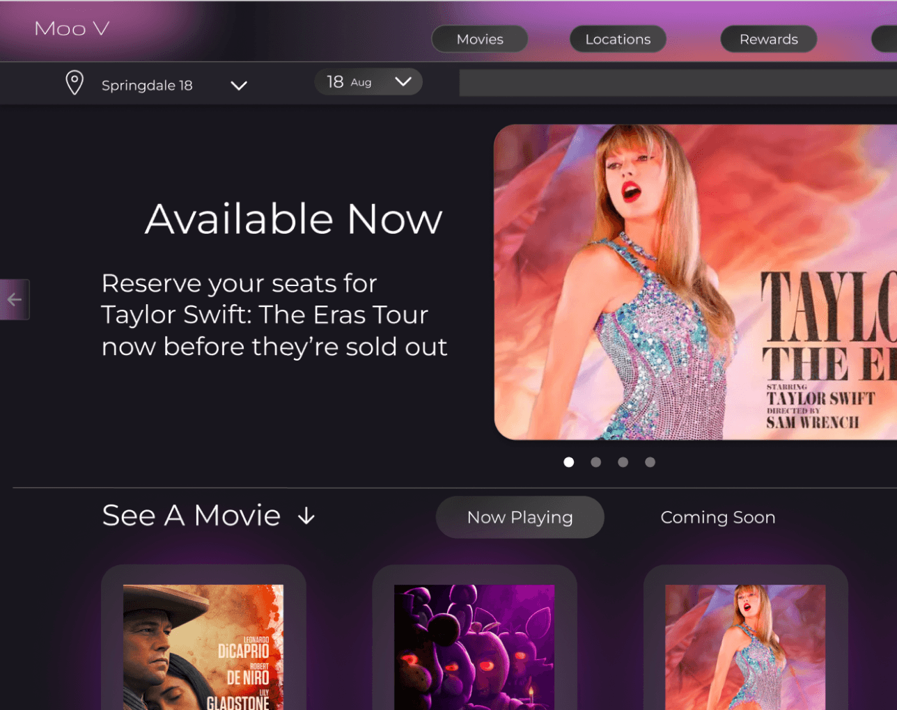
High-fidelity Prototype
High-fidelity Prototype
High-fidelity Prototype
The High-fidelity Prototype was used for user testing and is a working version of the final product.
The High-fidelity Prototype was used for user testing and is a working version of the final product.
The High-fidelity Prototype was used for user testing and is a working version of the final product.
View Hifi Prototype
View Hifi Prototype
View Hifi Prototype
Under Options, click “fit width,” then hit “Ctrl + \” to hide the Figma UI
Under Options, click “fit width,” then hit “Ctrl + \” to hide the Figma UI
Accessibility Considerations
Accessibility Considerations
Accessibility Considerations
1
1
1
I made sure all the text has proper contrast with the surrounding background.
I made sure all the text has proper contrast with the surrounding background.
I made sure all the text has proper contrast with the surrounding background.
2
2
2
I tried to make sure the text was large enough to read and included a zoom feature on the seatmap.
I tried to make sure the text was large enough to read and included a zoom feature on the seatmap.
I tried to make sure the text was large enough to read and included a zoom feature on the seatmap.
3
3
3
Going forward I would annotate the designs for keyboard and screen reader use for the developers.
Going forward I would annotate the designs for keyboard and screen reader use for the developers.
Going forward I would annotate the designs for keyboard and screen reader use for the developers.
Going Forward
Going Forward
Going Forward
Takeaways
Takeaways
Takeaways
Impact:
Impact:
Impact:
One of my goals was to create a better product than the competition, since they had a lackluster UX. The users who participated in my research said they really liked my website and that they liked it way more than companies like AMC and Cinemark after comparison.
One of my goals was to create a better product than the competition, since they had a lackluster UX. The users who participated in my research said they really liked my website and that they liked it way more than companies like AMC and Cinemark after comparison.
One of my goals was to create a better product than the competition, since they had a lackluster UX. The users who participated in my research said they really liked my website and that they liked it way more than companies like AMC and Cinemark after comparison.
What I Learned:
What I Learned:
What I Learned:
On this project I wanted to get into more advanced Figma stuff and I learned a lot in that regard. I also learned not to take anything for granted like assuming users will scroll down the page.
On this project I wanted to get into more advanced Figma stuff and I learned a lot in that regard. I also learned not to take anything for granted like assuming users will scroll down the page.
On this project I wanted to get into more advanced Figma stuff and I learned a lot in that regard. I also learned not to take anything for granted like assuming users will scroll down the page.
Next Steps
Next Steps
Next Steps
1
1
1
Going forward I would conduct a new round of research after iterating on my Hifi Prototype to see if my alterations were successful.
Going forward I would conduct a new round of research after iterating on my Hifi Prototype to see if my alterations were successful.
Going forward I would conduct a new round of research after iterating on my Hifi Prototype to see if my alterations were successful.
2
2
2
I could begin work on other user flows within the website, as this is just the main user flow.
I could begin work on other user flows within the website, as this is just the main user flow.
I could begin work on other user flows within the website, as this is just the main user flow.
3
3
3
I would annotate the designs for the developers and also organize the sticker sheet/design system some more.
I would annotate the designs for the developers and also organize the sticker sheet/design system some more.
I would annotate the designs for the developers and also organize the sticker sheet/design system some more.
Lets Connect!
Lets Connect!
Lets Connect!
Thank you for reviewing my work on the Moo V responsive website! If you’d like to see more or get in touch, you can copy my email address to your clipboard below or find me on LinkedIn.
Thank you for reviewing my work on the Moo V responsive website! If you’d like to see more or get in touch, you can copy my email address to your clipboard below or find me on LinkedIn.
Thank you for reviewing my work on the Moo V responsive website! If you’d like to see more or get in touch, you can copy my email address to your clipboard below or find me on LinkedIn.