Weather App
Quick Design Project
Quick Design Project
Contents
Contents
Contents
Project Overview
Project Overview
Project Overview
Project Background
Project Background
Project Background
My friend, who is a back-end engineer learning front-end development, asked me to design a weather app for him to try to make. I thought it would be a good opportunity to get some more design experience, so I agreed.
My friend, who is a back-end engineer learning front-end development, asked me to design a weather app for him to try to make. I thought it would be a good opportunity to get some more design experience, so I agreed.
My friend, who is a back-end engineer learning front-end development, asked me to design a weather app for him to try to make. I thought it would be a good opportunity to get some more design experience, so I agreed.
The Goal
The Goal
The Goal
Weather apps have been done a million times already, so I wasn’t trying to do anything groundbreaking. I just wanted to look at other weather apps and take what they did well and omit what they did poorly, so the competitive audit was key.
Weather apps have been done a million times already, so I wasn’t trying to do anything groundbreaking. I just wanted to look at other weather apps and take what they did well and omit what they did poorly, so the competitive audit was key.
Weather apps have been done a million times already, so I wasn’t trying to do anything groundbreaking. I just wanted to look at other weather apps and take what they did well and omit what they did poorly, so the competitive audit was key.
My Role:
My Role:
My Role:
UX Designer
UX Designer
UX Designer
Responsibilities:
Responsibilities:
Responsibilities:
Initial research, ideating,
wireframing, mockups,
prototyping, user testing
Initial research, ideating,
wireframing, mockups,
prototyping, user testing
Initial research, ideating,
wireframing, mockups,
prototyping, user testing
Project Duration:
Project Duration:
Project Duration:
February 2024
February 2024
February 2024
Understanding the User
Understanding the User
Understanding the User
User Research: Summary
User Research: Summary
User Research: Summary
I conducted a competitive audit to examine existing products’ successes and flaws, and user interviews to identify pain points.
Some products, such as the default android app, were generally liked by the users. It had a layout of cards displaying weather info, and the background looked good and changed with the weather/time of day. Users also liked the hero section/banner on google which displayed the current weather conditions with a matching picture background.
Others, such as the Weather Channel, were cluttered and full of ads and pop-ups which was frustrating for users.
User Research: Pain Points
User Research: Pain Points
User Research: Pain Points
1
1
1
Ads
Ads
Ads
Some products have ads within the layout as well as pop-up ads, both of which are extremely frustrating for the user, especially because other products don’t have ads.
Some products have ads within the layout as well as pop-up ads, both of which are extremely frustrating for the user, especially because other products don’t have ads.
Some products have ads within the layout as well as pop-up ads, both of which are extremely frustrating for the user, especially because other products don’t have ads.
2
2
2
Clutter
Clutter
Clutter
One product had articles about wellness and other topics/features not related to weather which were unnecessary and got in the way of users.
One product had articles about wellness and other topics/features not related to weather which were unnecessary and got in the way of users.
One product had articles about wellness and other topics/features not related to weather which were unnecessary and got in the way of users.
3
3
3
Unnecessary Steps
Unnecessary Steps
Unnecessary Steps
Some sites had lots of navigation and pages users would have to go between, which aren’t needed and make the user flow worse.
Some sites had lots of navigation and pages users would have to go between, which aren’t needed and make the user flow worse.
Some sites had lots of navigation and pages users would have to go between, which aren’t needed and make the user flow worse.
4
4
4
External Links
External Links
External Links
Some products didn’t include full details and instead had links to other websites that had more information.
Some products didn’t include full details and instead had links to other websites that had more information.
Some products didn’t include full details and instead had links to other websites that had more information.
Personas -
Personas -
Personas -
Because this was a quick design project I was trying to turn out quickly for my friend to work on, I didn’t make any personas or a user journey map, but I would normally always do those on a design project.
Because this was a quick design project I was trying to turn out quickly for my friend to work on, I didn’t make any personas or a user journey map, but I would normally always do those on a design project.
Because this was a quick design project I was trying to turn out quickly for my friend to work on, I didn’t make any personas or a user journey map, but I would normally always do those on a design project.
Starting the Design
Starting the Design
Starting the Design
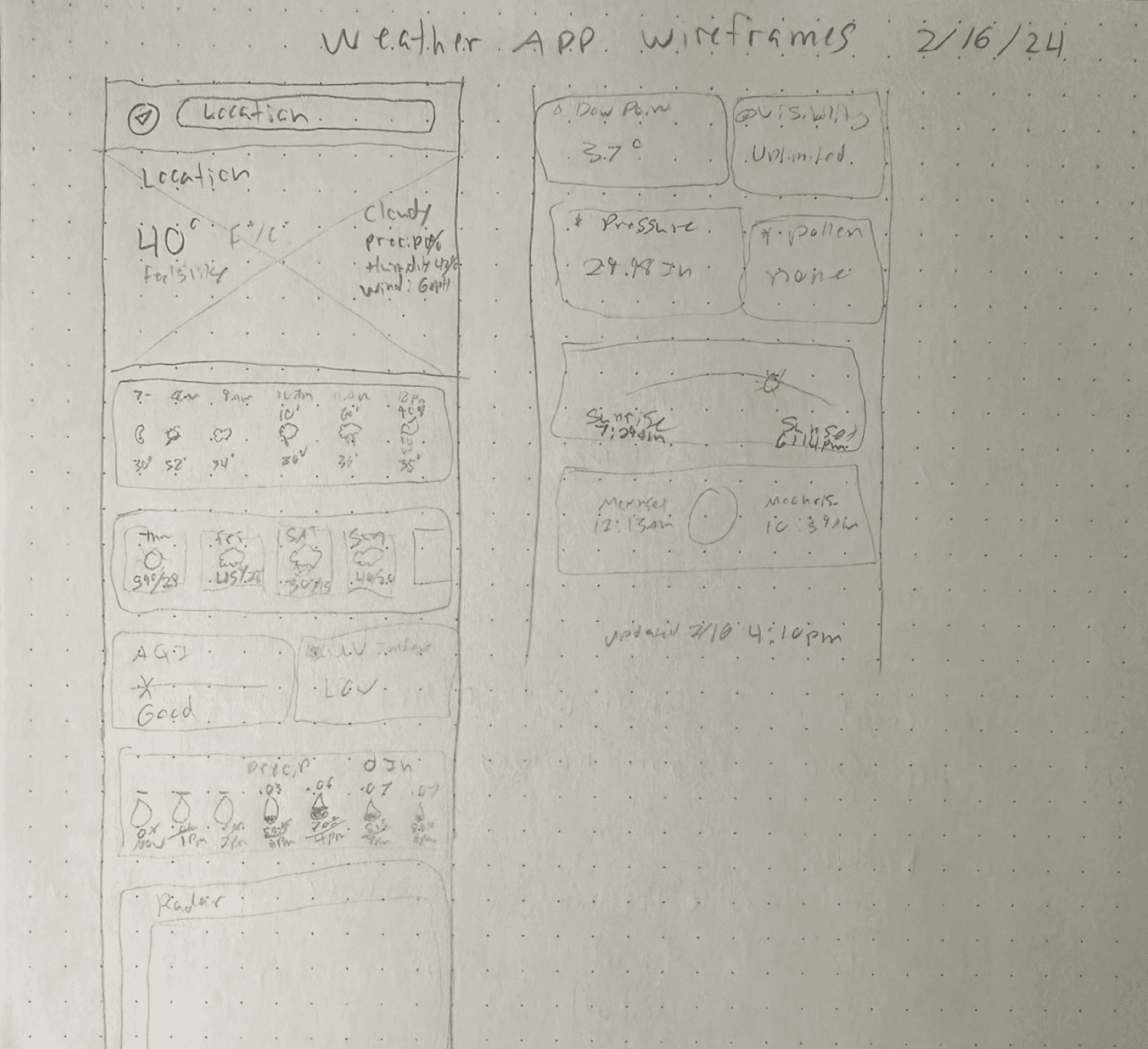
Paper Wireframes
Paper Wireframes
Paper Wireframes
I tried a few iterations of each screen and then combined what I liked into the final version. Paper wireframes are important because they allow you to figure out or redo your designs before you make them.
I tried a few iterations of each screen and then combined what I liked into the final version. Paper wireframes are important because they allow you to figure out or redo your designs before you make them.
I tried a few iterations of each screen and then combined what I liked into the final version. Paper wireframes are important because they allow you to figure out or redo your designs before you make them.
Digital Wireframes
Digital Wireframes
Digital Wireframes
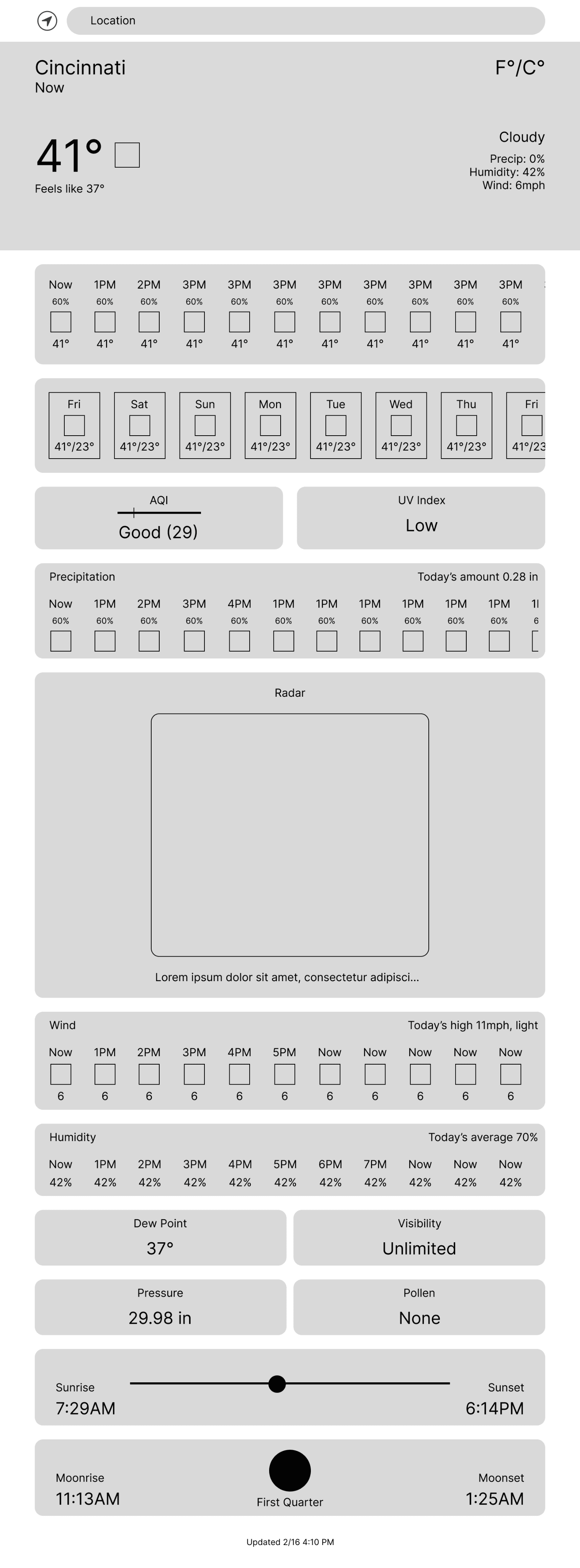
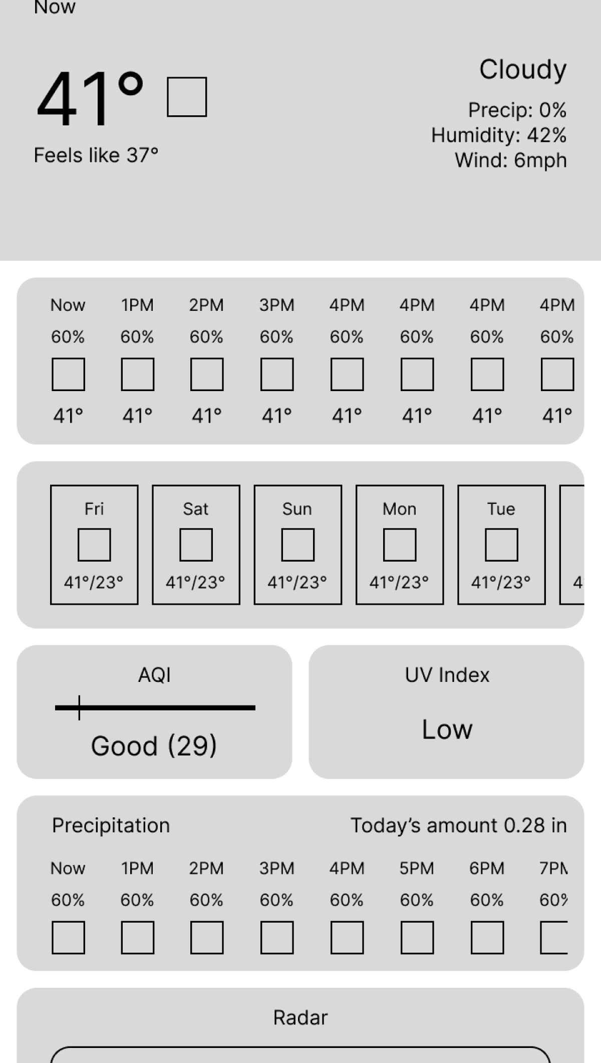
I emulated google’s hero section for today’s current weather, and used a card layout with sidescrolling for the rest of the information. I kept everything on one page so users would have an easy user flow and no unnecessary steps.
I emulated google’s hero section for today’s current weather, and used a card layout with sidescrolling for the rest of the information. I kept everything on one page so users would have an easy user flow and no unnecessary steps.
I emulated google’s hero section for today’s current weather, and used a card layout with sidescrolling for the rest of the information. I kept everything on one page so users would have an easy user flow and no unnecessary steps.
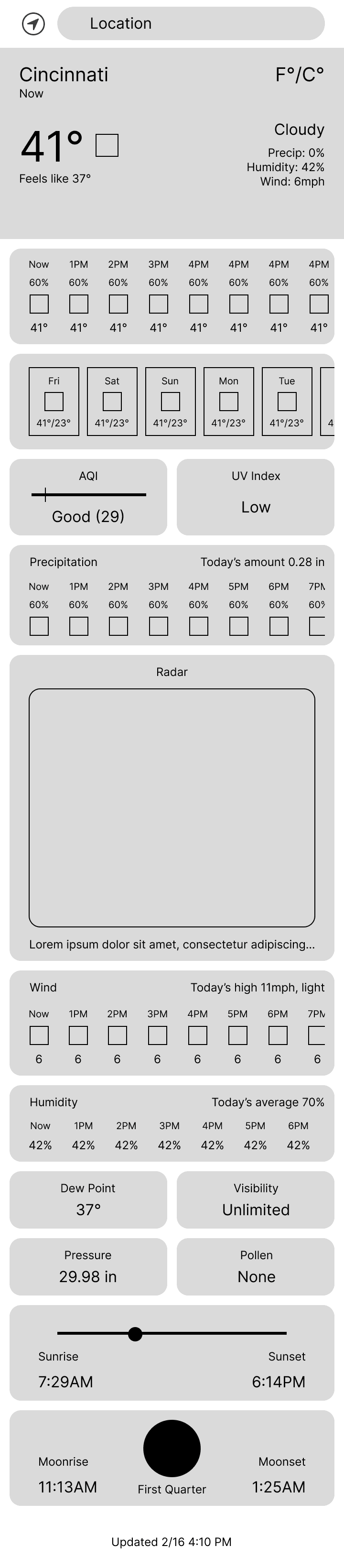
Other info such as weekly forecast, hourly weather and wind conditions are displayed in cards.
Other info such as weekly forecast, hourly weather and wind conditions are displayed in cards.
All of the current weather info is displayed at the top with a related image.
All of the current weather info is displayed at the top with a related image.
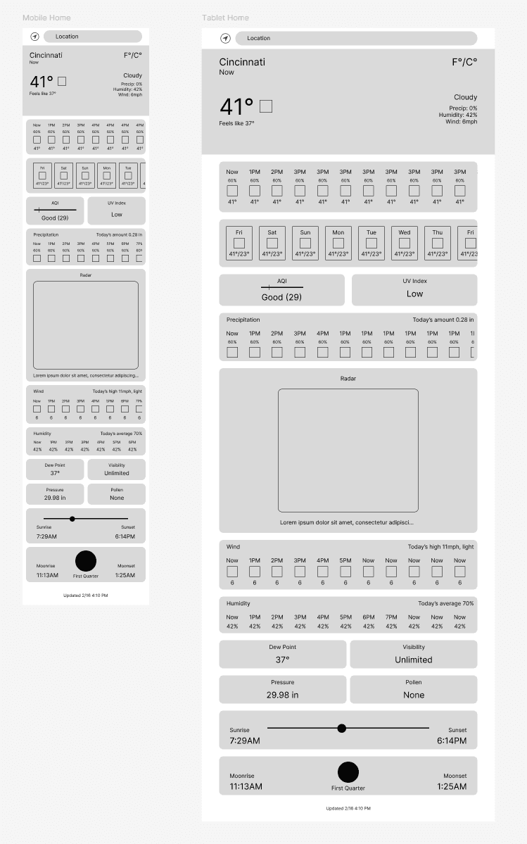
Mobile
Mobile
Tablet
Tablet
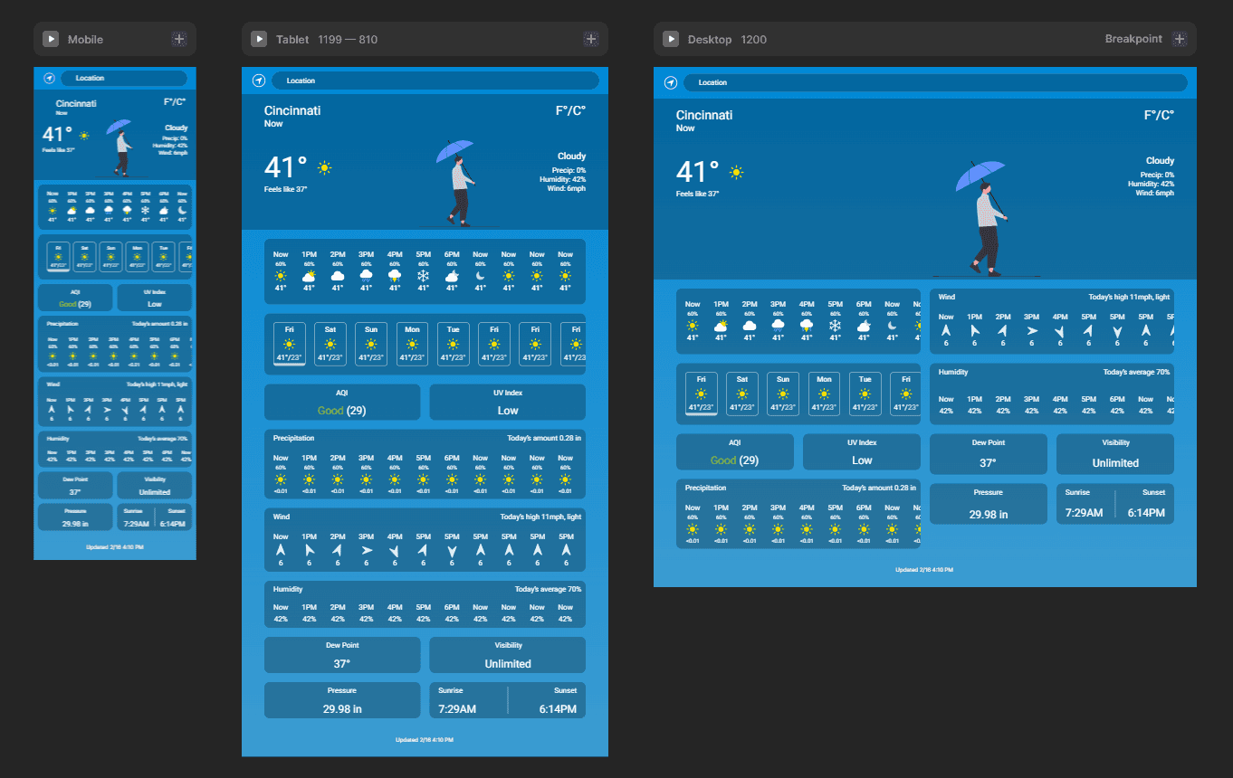
The card layout lends itself well to being responsive.
The card layout lends itself well to being responsive.
The card layout lends itself well to being responsive.
Low-fidelity Prototype
Low-fidelity Prototype
Low-fidelity Prototype
It’s only one page, but you can have a look at it here:
View the Weather App Low-Fidelity Prototype that I used for user testing.
It’s only one page, but you can have a look at it here:
View the Weather App Low-Fidelity Prototype that I used for user testing.
It’s only one page, but you can have a look at it here:
View the Weather App Low-Fidelity Prototype that I used for user testing.
Usability Study: Findings
Usability Study: Findings
Usability Study: Findings
Before I moved on to mockups I tested my designs with users to see if the designs were working well and to find any pain points. There were a couple core features I had overlooked that are necessary to the functionality of the app that were missing, but users were happy with the experience overall.
Before I moved on to mockups I tested my designs with users to see if the designs were working well and to find any pain points. There were a couple core features I had overlooked that are necessary to the functionality of the app that were missing, but users were happy with the experience overall.
Before I moved on to mockups I tested my designs with users to see if the designs were working well and to find any pain points. There were a couple core features I had overlooked that are necessary to the functionality of the app that were missing, but users were happy with the experience overall.
Findings
Findings
Findings
1
1
There needs to be a way to switch between forecast days.
There needs to be a way to switch between forecast days.
There needs to be a way to switch between forecast days.
2
2
The precipitation section needed more info.
The precipitation section needed more info.
The precipitation section needed more info.
3
3
Users liked the design and found it useful overall.
Users liked the design and found it useful overall.
Users liked the design and found it useful overall.
Refining the Design
Refining the Design
Refining the Design
Mockups
Mockups
Mockups
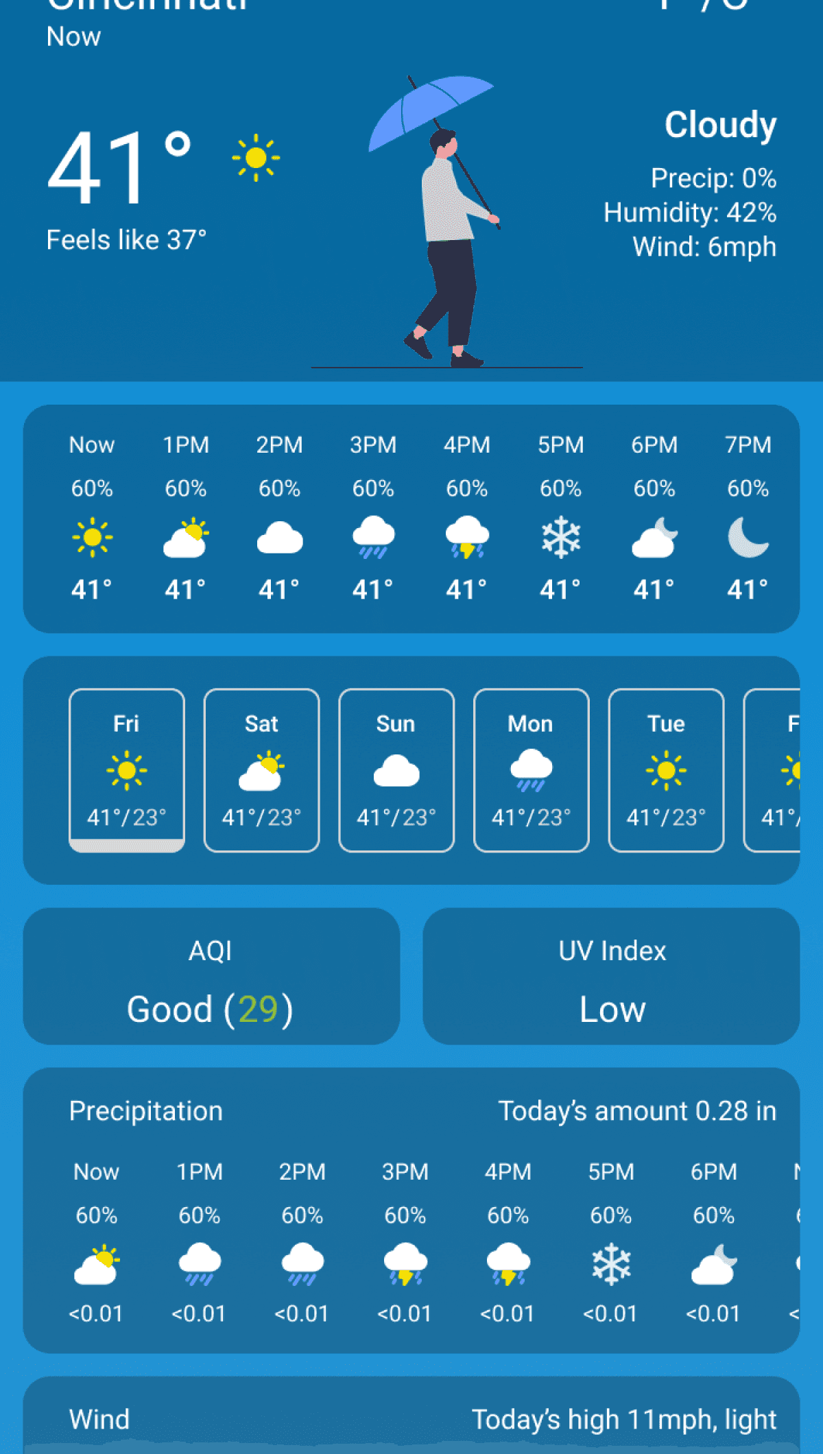
The app needs a way to choose which day you’re viewing the forecast for, so I made the daily cards selectable. The current one is highlighted and that day’s info is displayed in the top banner. The precipitation section was missing precipitation amounts, so I added that as well.
The app needs a way to choose which day you’re viewing the forecast for, so I made the daily cards selectable. The current one is highlighted and that day’s info is displayed in the top banner. The precipitation section was missing precipitation amounts, so I added that as well.
The app needs a way to choose which day you’re viewing the forecast for, so I made the daily cards selectable. The current one is highlighted and that day’s info is displayed in the top banner. The precipitation section was missing precipitation amounts, so I added that as well.
Wireframes
Wireframes
Mockups
Mockups
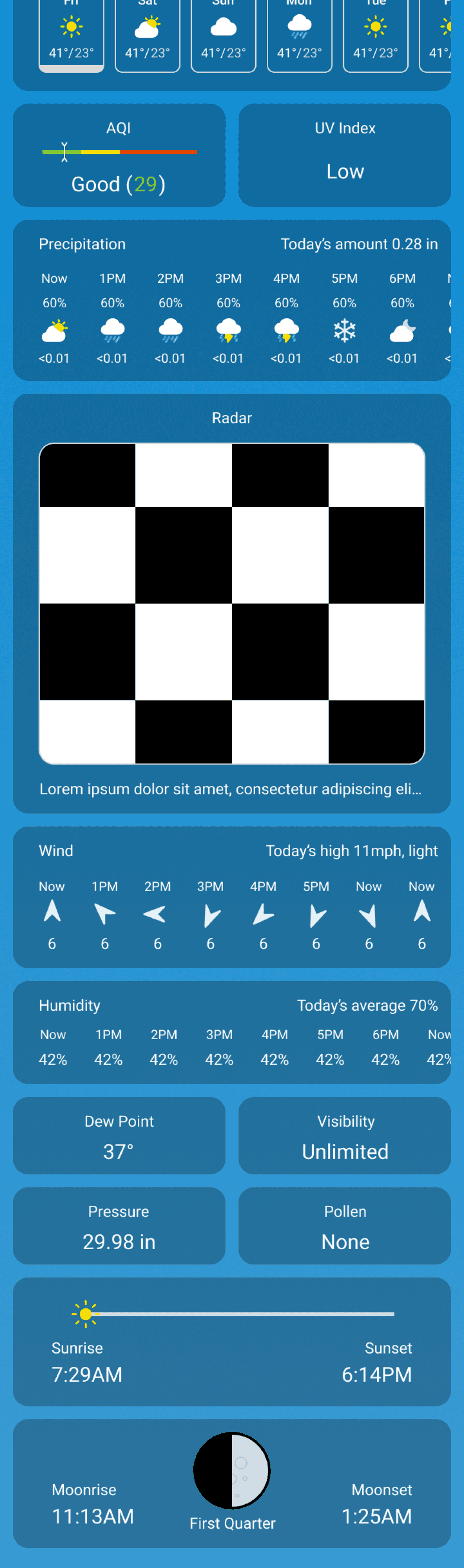
My friend said the API he was using didn’t support some of the features I included such as the radar, pollen count, and moon phases, so I took those out and adapted the designs to what the API could provide data for.
My friend said the API he was using didn’t support some of the features I included such as the radar, pollen count, and moon phases, so I took those out and adapted the designs to what the API could provide data for.
My friend said the API he was using didn’t support some of the features I included such as the radar, pollen count, and moon phases, so I took those out and adapted the designs to what the API could provide data for.
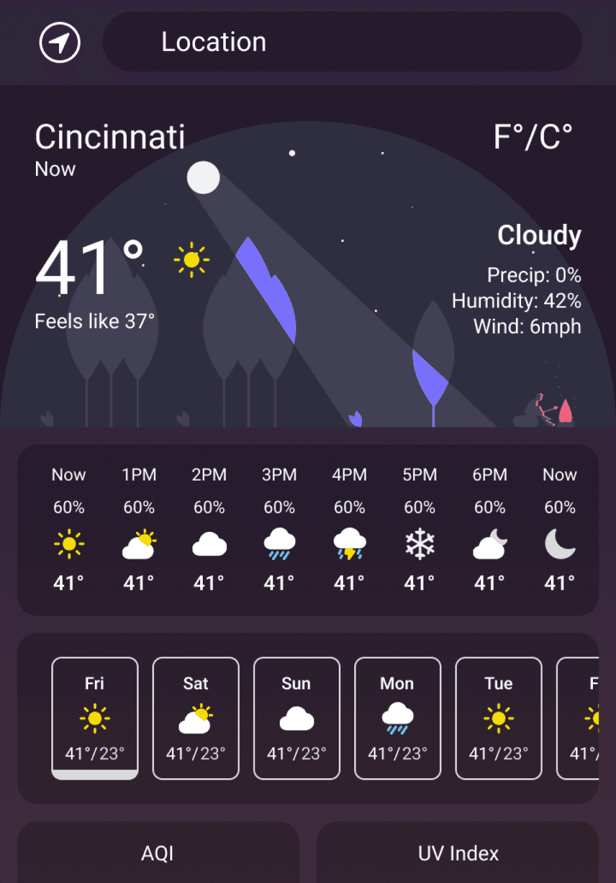
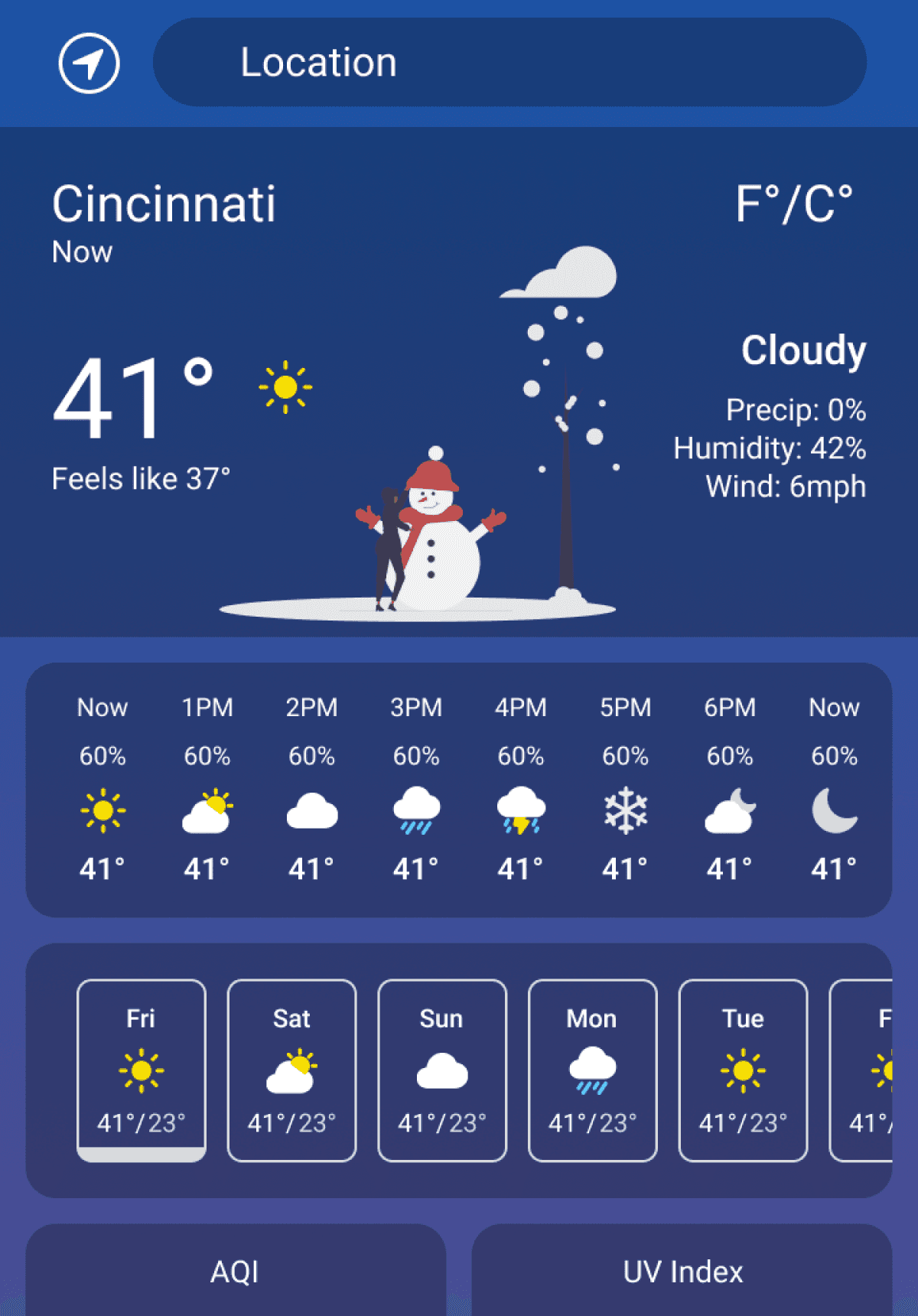
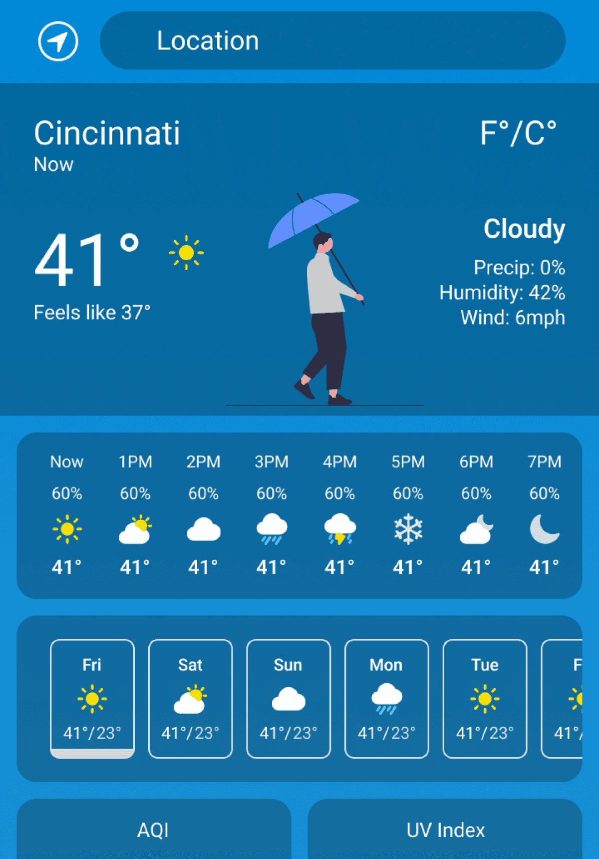
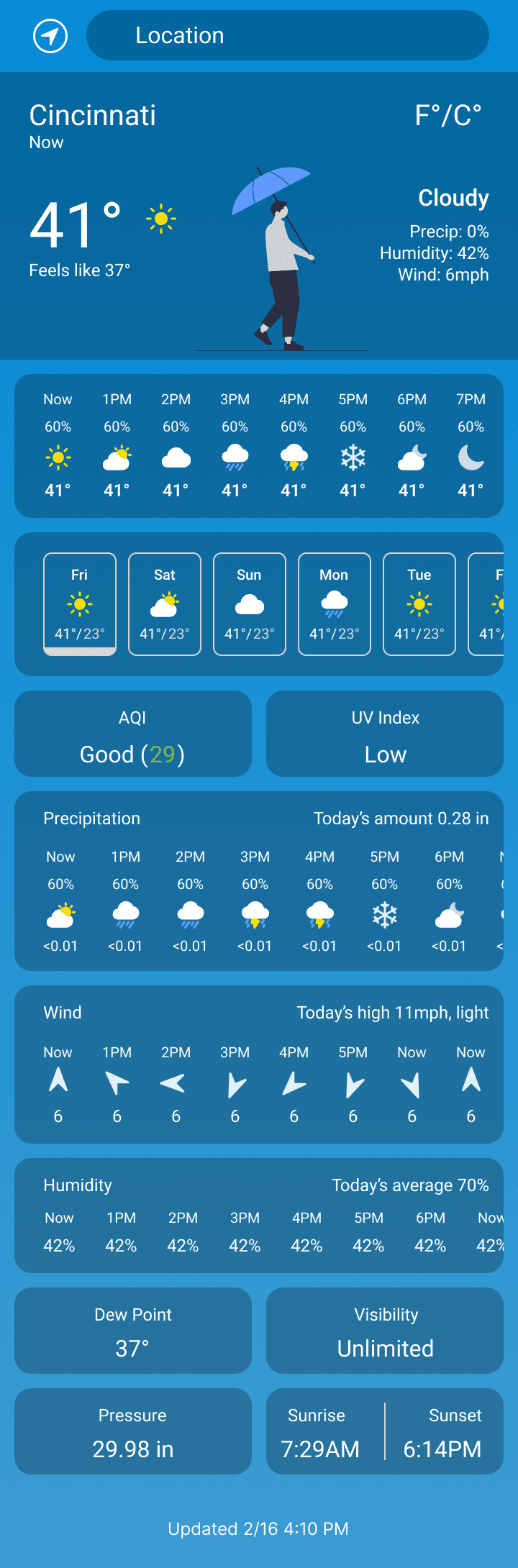
Mockups V1
Mockups V1
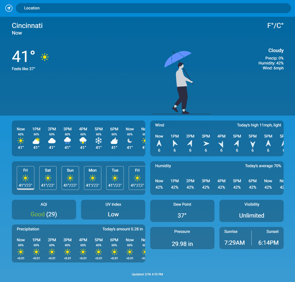
Mockups V2
Mockups V2
Mockups - Mobile
Mockups - Mobile
Day
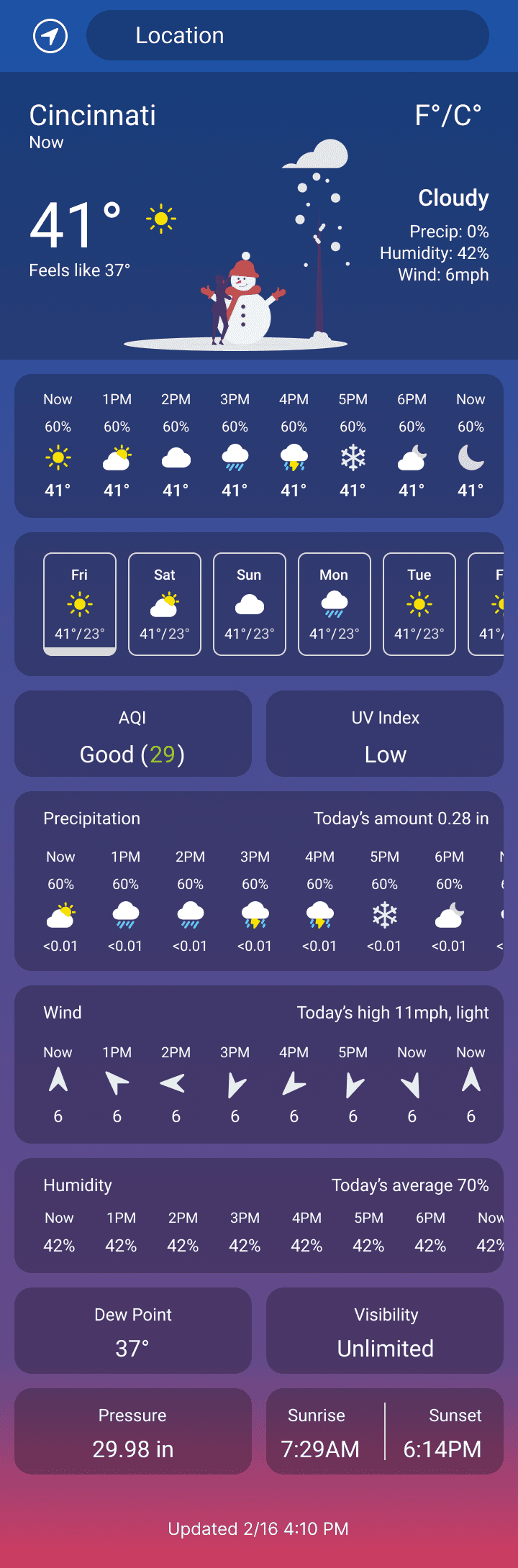
Dawn/Dusk
Day
Dawn/Dusk
Night
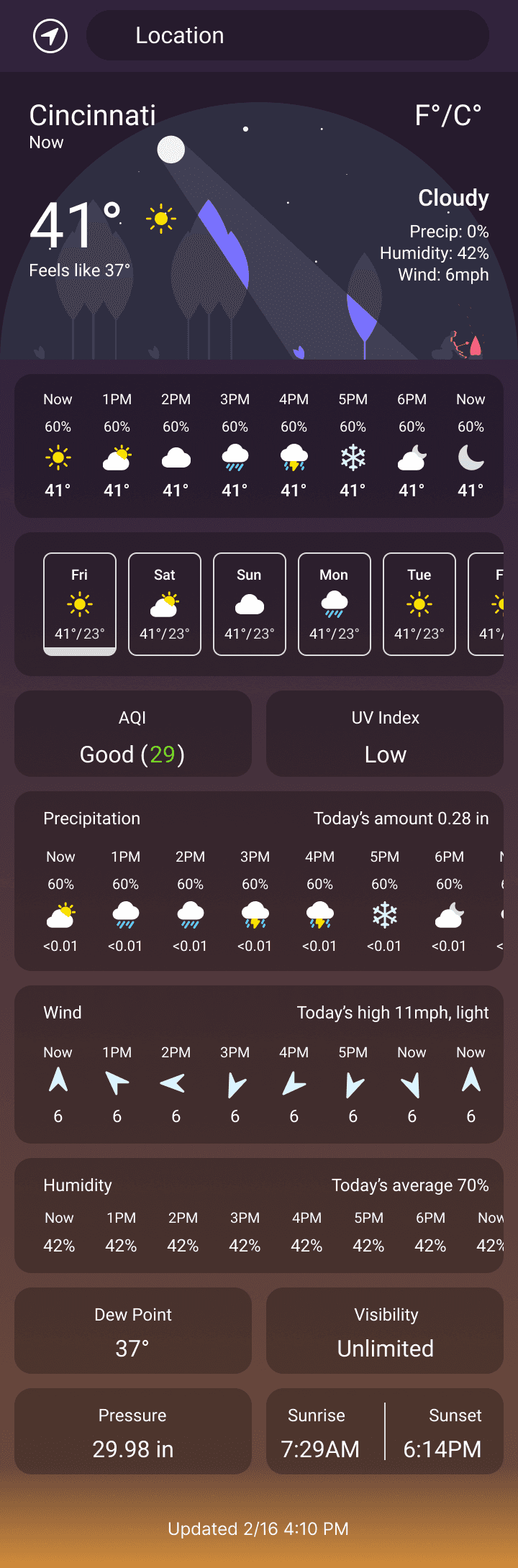
Night

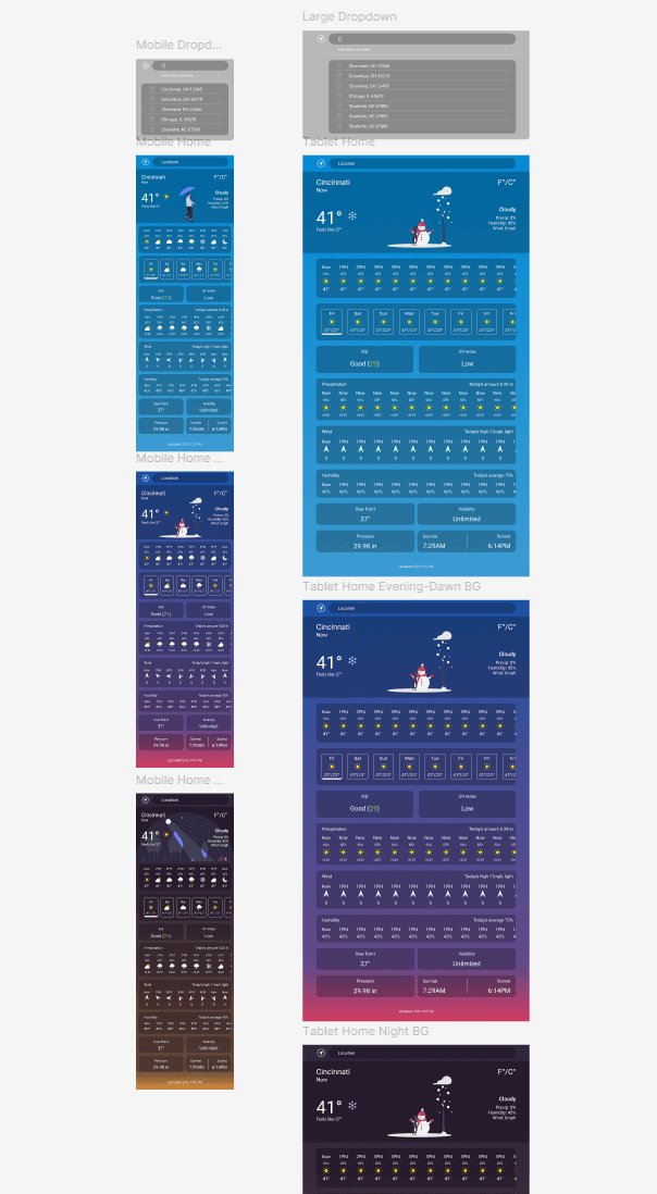
Tablet
Tablet
Desktop
Desktop
High-fidelity Prototype
High-fidelity Prototype
High-fidelity Prototype
View the Weather App High-Fidelity Prototype in Figma.
View the Weather App High-Fidelity Prototype in Figma.
View the Weather App High-Fidelity Prototype in Figma.
I also copied the designs into Framer in case it would be easier for my engineer friend to work on it there. It isn’t functioning as a weather service but it is fully responsive. Have a look here: https://temperature.framer.website/
I also copied the designs into Framer in case it would be easier for my engineer friend to work on it there. It isn’t functioning as a weather service but it is fully responsive. Have a look here: https://temperature.framer.website/
I also copied the designs into Framer in case it would be easier for my engineer friend to work on it there. It isn’t functioning as a weather service but it is fully responsive. Have a look here: https://temperature.framer.website/
Figma
Figma
Figma
Framer
Framer
Framer
Accessibility Considerations
Accessibility Considerations
Accessibility Considerations
1
1
1
I used a color contrast checker to test the contrast of the text to the background and made adjustments to make sure the text is readable.
I used a color contrast checker to test the contrast of the text to the background and made adjustments to make sure the text is readable.
I used a color contrast checker to test the contrast of the text to the background and made adjustments to make sure the text is readable.
2
2
2
I tried to make use of icons and imagery a lot to convey information without language barriers.
I tried to make use of icons and imagery a lot to convey information without language barriers.
I tried to make use of icons and imagery a lot to convey information without language barriers.
3
3
3
I made the design mobile-friendly and tried to keep it as simple as possible.
I made the design mobile-friendly and tried to keep it as simple as possible.
I made the design mobile-friendly and tried to keep it as simple as possible.
Going Forward
Going Forward
Going Forward
Takeaways
Takeaways
Takeaways
Impact:
Impact:
Impact:
My software engineer friend started taking formal classes shortly after I finished this so he never actually built it, which was a little frustrating. I still put a lot of work into it despite it being a quick project so I’m including it in my portfolio. During user testing participants said they liked the design and it was useful, which I think is pretty good for something that has been done so many times already.
My software engineer friend started taking formal classes shortly after I finished this so he never actually built it, which was a little frustrating. I still put a lot of work into it despite it being a quick project so I’m including it in my portfolio. During user testing participants said they liked the design and it was useful, which I think is pretty good for something that has been done so many times already.
My software engineer friend started taking formal classes shortly after I finished this so he never actually built it, which was a little frustrating. I still put a lot of work into it despite it being a quick project so I’m including it in my portfolio. During user testing participants said they liked the design and it was useful, which I think is pretty good for something that has been done so many times already.
What I Learned:
What I Learned:
What I Learned:
Despite being a quick project, I learned quite a bit while making this design.
Icons - There are a lot of icons in this design. Normally I would use premade icons from a design library but for this I needed a lot of specific Icons, so I made a lot of my own from scratch or altered existing ones to fit what I needed.
Working with an engineer - This project was the first time I really worked with an engineer. He didn’t really know what I do as a UX Designer and I didn’t really know what he was doing as an engineer so good communication was important. I had to make alterations to the design because of limitations on the backend, and I had to explain to him what I was doing during the design process and the design decisions I made.
Displaying a lot of info on one screen - We wanted to have no tabs if possible and have everything on one screen to keep it simple. I had to figure out a way to fit all of the relevant/necessary info on one screen without it looking busy or jumbled.
Next Steps
Next Steps
Next Steps
1
1
1
I haven’t done a round of user testing after the most recent mockups iteration so that would be the next step.
I haven’t done a round of user testing after the most recent mockups iteration so that would be the next step.
I haven’t done a round of user testing after the most recent mockups iteration so that would be the next step.
2
2
2
Find another engineer to build the designs.
Find another engineer to build the designs.
Find another engineer to build the designs.
3
3
3
Work with the engineer to get the app built and make any design changes I need to, and launch it as a working weather service.
Work with the engineer to get the app built and make any design changes I need to, and launch it as a working weather service.
Work with the engineer to get the app built and make any design changes I need to, and launch it as a working weather service.
Lets Connect!
Lets Connect!
Lets Connect!
Thank you for reviewing my work on the Weather App! If you’d like to see more or get in touch, you can copy my email address to your clipboard below or find me on LinkedIn.
Thank you for reviewing my work on the Weather App! If you’d like to see more or get in touch, you can copy my email address to your clipboard below or find me on LinkedIn.
Thank you for reviewing my work on the Weather App! If you’d like to see more or get in touch, you can copy my email address to your clipboard below or find me on LinkedIn.